As we shed our winter coats and snowy days for sundresses and spring fever, it’s as if the world is brightening around us. Birds chirping cheerily are our new morning coffee and flowers bathed in sunlight act as our morning read. Days are longer and the world basks in color!
Caroline Kopp understands the power of color and brings it to each one of her projects. Today, Kopp takes GDG behind the process of adding pops of color to brighten the interior of a dark West End NYC space, with a whole lot of springtime hues, artwork and throw pillows.
Holly Speck, Editor: What was the inspiration behind this West End design? What were your client’s must-haves or requests?
Caroline Kopp: My clients had a dark apartment they had just bought and wanted it to feel brighter and bring it closer to the pre-war heritage. Previously it had been treated in this overly modern way, which was not appropriate to the 1920s building. They appreciate quality — the husband, in particular, comes from a very artistic and design conscious, sophisticated family.
HS: Throughout this design, and much of your designs, I’ve noticed powerful pops of color. How do you suggest introducing color within a mostly monochromatic/neutral space?
CK: In general, pillows and throws offer a relatively simple way to introduce color without a large investment. I also love flowers for that pop of color — they are low commitment, yet truly add an important layer of beauty, as well as a sense of luxury.
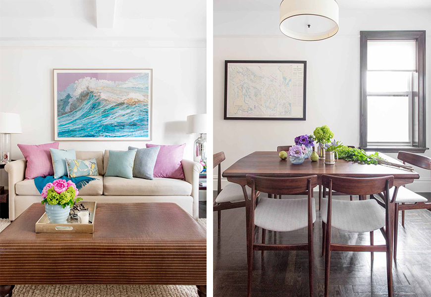
For me, I find the most color inspiration from art. It was incredibly exciting and rewarding to work with these clients as they shared my passion for art and we all fell in love with this unique piece above the sofa. This artwork is very “meta”/postmodern in the way it plays with our understanding of the artistic medium — it is a large-scale photo of a collage, which is in turn made up of maps. This unique photograph is suited to the intelligence and depth of understanding that my clients have.
HS: Where was the artwork sourced from in this project? How did art add pops of color and influence the spaces overall tone?
CK: I sourced this piece from Lumas, which is a great place to find accessible photography, either online or in one of their NYC showrooms. Lumas can handle framing but for this particular work we chose a beautiful custom frame with a handsome taupe finish on wood.
The throw pillows draw from the hues in the photography and these pillows were actually added a few years after I designed the space. The pillows I originally had on the sofa were in muted sea glass tones that were more serene than the bright, playful pops of color we have there now. The original pillows were looking a little tired after wear and tear from young kids so I was thrilled by the opportunity to introduce strong colors for the pillow refresh. These new pillows are from one of my absolute favorite fabric lines — Manuel Canovas, the colors they do are “YAASSSSSS” in my book.
Some people think matching the decor to the art is tacky but if done intelligently, I personally LOVE this approach — it actually sets the art off that much more. I remember seeing a Vogue article on a Miller sister who had this amazing room done all around the palette of a Botero painting — seeing that emboldened me to my position that matching decor to art is in fact brilliant. Furthermore, if you have an artwork that has an amazing palette, you can just use that as your design inspiration for the color story in a room — it’s fantastic because you already know it’s all going to work well together.
HS: How do you subtly/gently introduce color to a color-shy client?
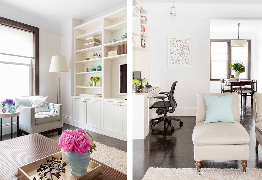
CK: These days it’s easier as color is on trend so people are well aware that other, more naturally stylish people are doing color. If you’re seeing it everywhere then it’s not as hard to embrace it. I do think for many years, particularly in New York, color was seen as perhaps not as sophisticated. In apartment living, if you only have one main living space to work with then it’s understandable if you don’t want to commit to a strong color. The gentlest way to introduce color is to start with a neutral fabric on a large upholstered piece and then layer in color with the art and accessories. This way you have more flexibility and can play with it until you reach your comfort level. It’s often times an evolution, as was the case in this living room.

HS: What acts as the best pieces for colorful accents on bookshelves or coffee tables?
CK: I am an avid collector of boxes — beautiful lacquer boxes stacked on books is such a winning look, especially when mixed in with glass or ceramic vases. For an added design element I wrap books with colored paper. It is easy and inexpensive and makes all the difference.
HS: Any tips for efficient, yet ‘pretty’ ways to do home organization?
CK: I can’t say enough about boxes, they are pretty and also functional for organization. Years ago I worked for a woman and her personal filing system was beautifully simple — when something came in that she needed to keep for her records she would just lay the paper on the top of a pile that was inside a box. This way everything that went into the box was automatically filed in chronological order. She was a minimalist.
I also love flat files as they are really handy for keeping all sorts of things, and since the drawers are shallow you can basically see everything that is inside. It beats a bottomless junk drawer and feels chic, it’s like a stack of trays that can be closed.
Where you put your stuff helps, but the most important tip is basic: at least once a week, make a point to de-clutter your space. That is free design advice.
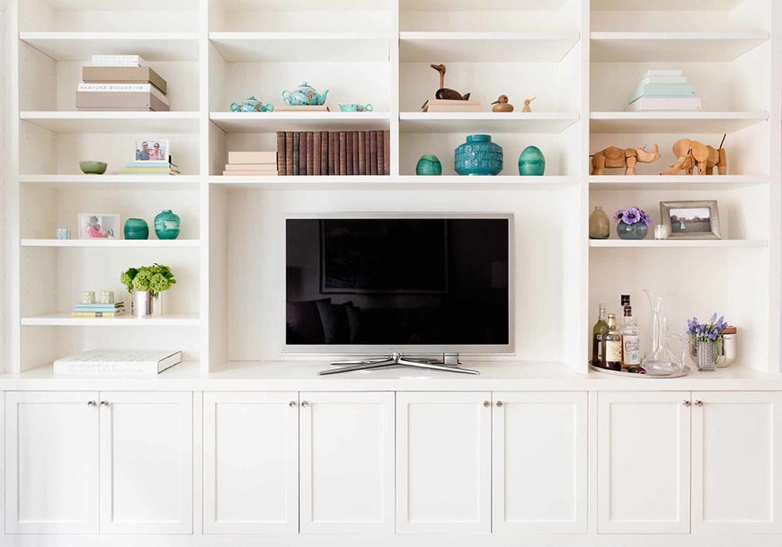
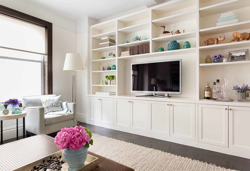
HS: When organizing a bookshelf and its accents, like in this space, what are the main priorities?
CK: With this bookcase, the client already had quite a few objects they had collected in their travels, so we obviously wanted to use those. An easy way to group things is by color story, that creates a cohesive “moment” within each bookcase cubby. From there, I bunch the accents together and alternate these groups so you have some emptier spaces and other spaces that are more full. This makes it easy on the eyes.
Over his desk, I did a layered look by pushing the books to the back and then placing sculptural objects in front so that the books form a backdrop to the mementos and personal items.
HS: How do you ‘Spring Clean’ or ‘refresh’ your own home?
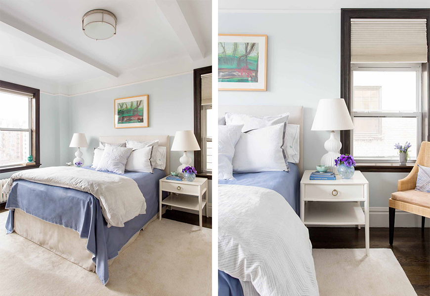
CK: Throwing stuff away is critical to having that fresh feeling. I also like to switch some things out for the season and will change all the bedding to a lighter weight of sheeting and duvet, get new white towels, remove decor that feels wintery and bring in some new plants. Every spring I look over the upholstery and consider if something needs to be recovered or cleaned, and then I get that done.
HS: How do you suggest bringing the outside, inside, or adding a bit of fresh air to a home?
CK: Plants are such a great way to do this, whether it is a houseplant, a tree, or cut greenery. I also have a weakness for sky, cloud, and water motifs. We had the wave artwork in this living room and that water reference brings a restful, meditative element to the space. I adore blue in all its shades and love to use large-scale artwork that has the sky and water motifs because it offers such a powerful way to bring in the blue. It also tends to get a lot of compliments.
Shop The Products Used Within The Space:
Holland and Sherry sofa fabric
DeLany & Long On Dining Chairs
Schumacher woven pleather on ottoman