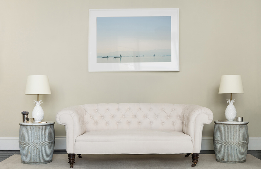
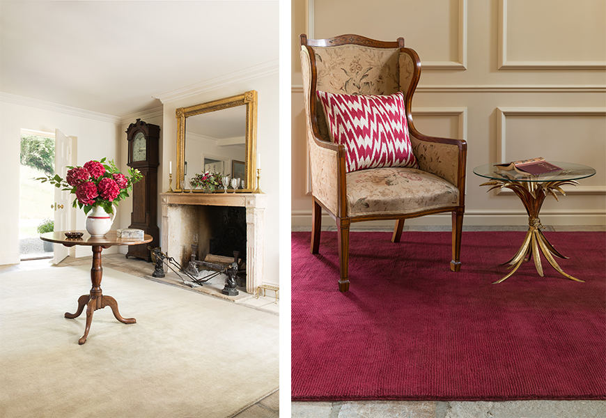
Farrow & Ball and The Rug Company—two British brands that understand the power of craftsmanship and color—have teamed up on a new collection of handloom rugs available in 12 beautiful colorways. The rug line, The Complementary Colour Collection, features an accent and a natural tone for six of Farrow & Ball’s neutral categories: traditional, yellow based, red based, contemporary, easy, and architectural. Along with the range of color choices, three textures are available: plain wool, cut and loop stripe, and wool with a silk border. Milly Wright, creative director for The Rug Company, says of the collaboration: “A celebration of pared back simplicity, this collection makes it very easy to choose a beautiful handmade rug for any interior scheme.”
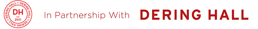
TRADITIONAL NEUTRAL: Holland Stone
Inspired by the Georgian townhouses near The Rug Company’s Holland Park, London, home, this neutral can add a sophisticated touch to any room.
Complementary Farrow & Ball Traditional Neutral Paints:
Lime White No. 1
Slipper Satin No. 2004
Off White No. 3
Old White No. 4
 TRADITIONAL NEUTRAL: Lots Blue
A soothing color that evokes the sea and sky, Lots Blue is named after the location of The Rug Company’s very first showroom, Lots Road.
Complementary Farrow & Ball Traditional Neutral Paints:
Lime White No. 1
Slipper Satin No. 2004
Off White No. 3
Old White No. 4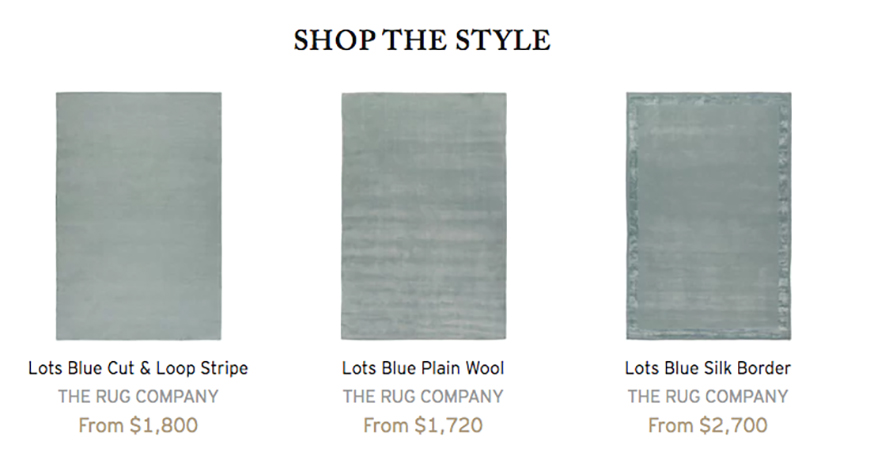
 (Left) YELLOW-BASED NEUTRAL: Clarendon
This warm, classic beige is the perfect hue for interiors of all styles.
Complementary Farrow & Ball Yellow-Based Neutral Paints:
White Tie No. 2002
New White No. 59
Matchstick No. 2013
String No. 8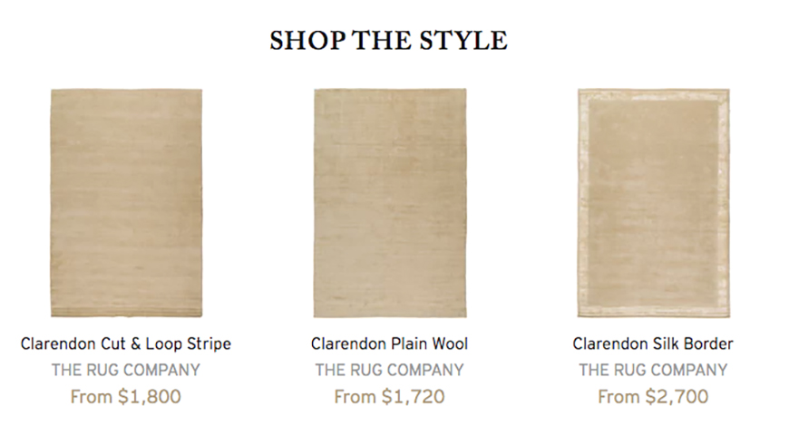
(Right) YELLOW-BASED NEUTRAL: Keepers Red
This deep, yet versatile, shade is named after the Keepers Cottage, an inviting redbrick near Farrow & Ball’s home in Dorset.
Complementary Farrow & Ball Yellow-Based Neutral Paints:
White Tie No. 2002
New White No. 59
Matchstick No. 2013
String No. 8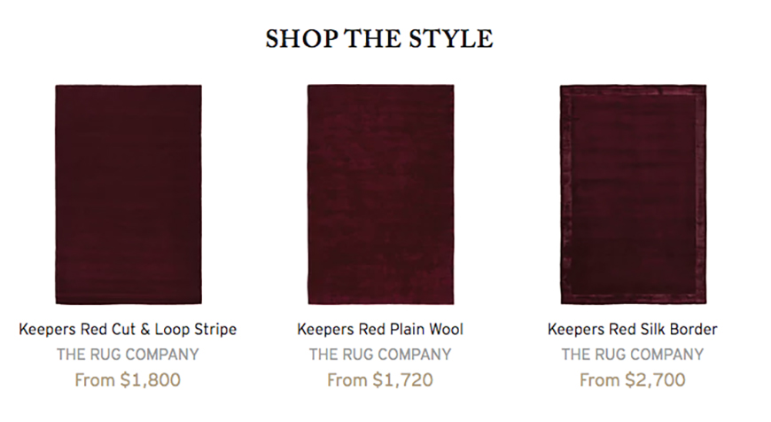
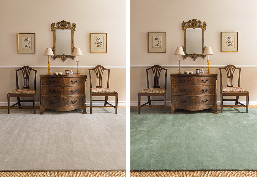 (Left) RED-BASED NEUTRAL: Princedale Pale
Princedale Pale is a light neutral that can add a welcoming touch to just about any space.
Complementary Farrow & Ball Red-Based Neutral Paints:
Pointing No. 2003
Dimity No. 2008
Joa’s White No. 226
Oxford Stone No. 264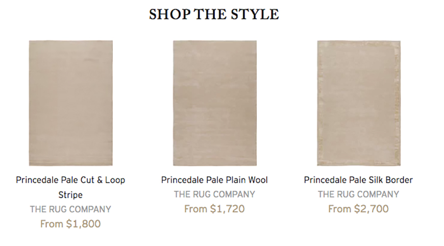
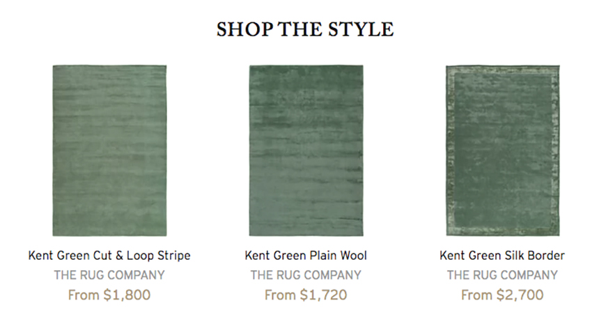
(Right) RED-BASED NEUTRAL: Kent Green
Whether you’re partial to a more modern or traditional aesthetic, this green hue can infuse energy into an interior in an instant.
Complementary Farrow & Ball Red-Based Neutral Paints:
Pointing No. 2003
Dimity No. 2008
Joa’s White No. 226
Oxford Stone No. 264
 (Left) CONTEMPORARY NEUTRAL: Sam’s Stone
This natural tone, designed in recognition of The Rug Company’s longest-standing staff member, can give a room a contemporary feel.
Complementary Farrow & Ball Contemporary Neutral Paints:
All White No. 2005
Strong White No. 2001
Skimming Stone No. 241
Elephant’s Breath No. 229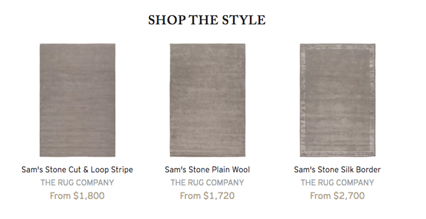
(Right) CONTEMPORARY NEUTRAL: Portland Pink
For this pink hue, Wright says it was all about pinpointing the right pink tone.”It was important that it wasn’t too sugary or peachy,” she says. “I wanted it to be a pink that would work well in any room—not just a girl’s playroom. We offset it with a warm Weimaraner grey to bring out the red and not the purple in the tone.”
Complementary Farrow & Ball Contemporary Neutral Paints:
All White No. 2005
Strong White No. 2001
Skimming Stone No. 241
Elephant’s Breath No. 229
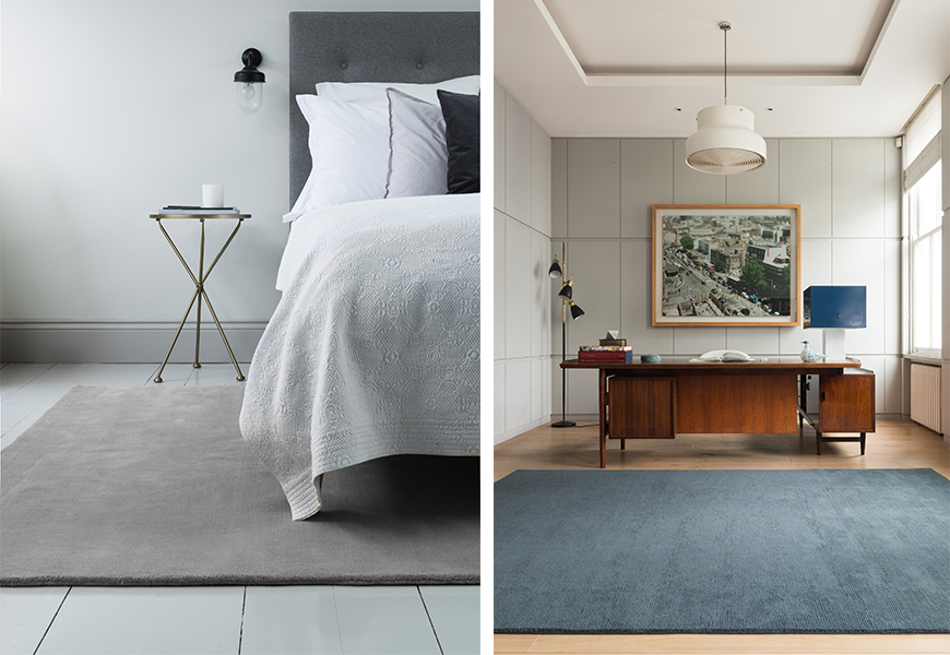 (Left) EASY NEUTRAL: Order Grey
This fresh grey hue is inspired by the military grey wool greatcoats of the Household Guards.
Complementary Farrow & Ball Easy Neutral Paints:
Wevet No. 273
Ammonite No. 274
Cornforth White No. 228
Purbeck Stone No. 275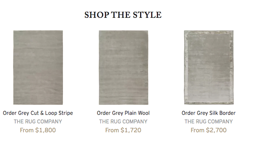
(Right) ARCHITECTURAL NEUTRAL: Wooster
For Wooster, Wright drew inspiration from the ironwork found on the facades of New York City’s Wooster Street. This cool, dark blue tone, which pairs well with Wizlet, is full of character. “I love getting lost in a deep indigo blue and I have been in constant search for the perfect cool light grey for my home. When I found it, I loved it so much I named it after my daughter.”
Complementary Farrow & Ball Architectural Neutral Paints:
Blackened No. 2011
Dimpse No. 277
Pavilion Gray No. 242
Manor House Gray No. 265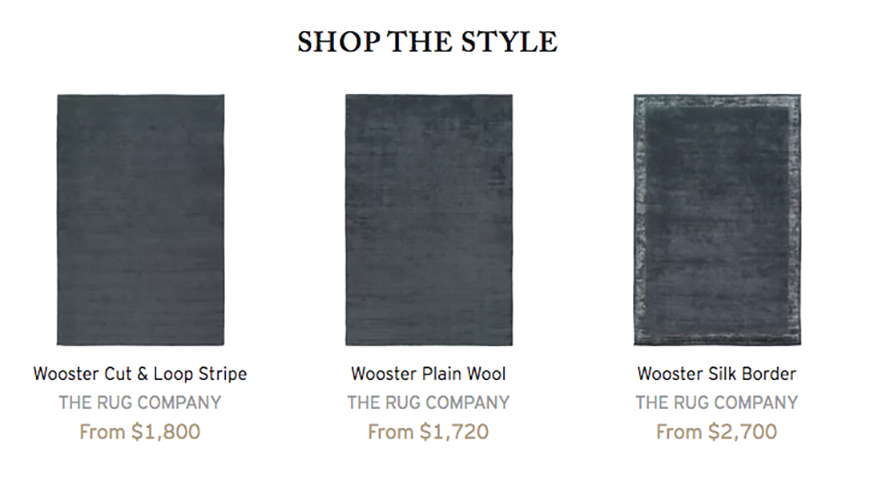
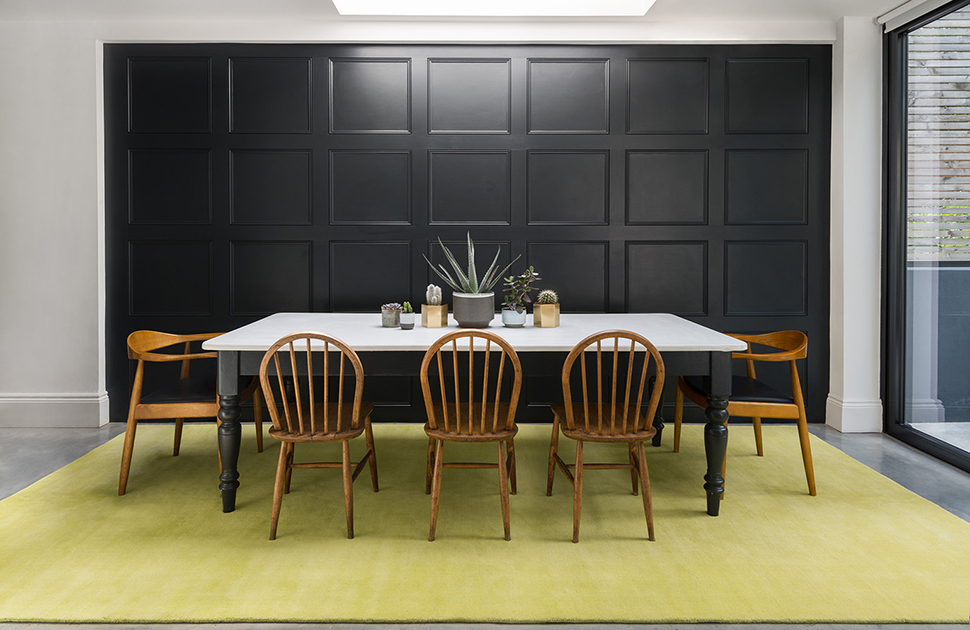 EASY NEUTRAL: Melrose Yellow
A nod to sunny Los Angeles and the perfect complement to Order Grey, this chartreuse makes a statement.
Complementary Farrow & Ball Easy Neutral Paints:
Wevet No. 273
Ammonite No. 274
Cornforth White No. 228
Purbeck Stone No. 275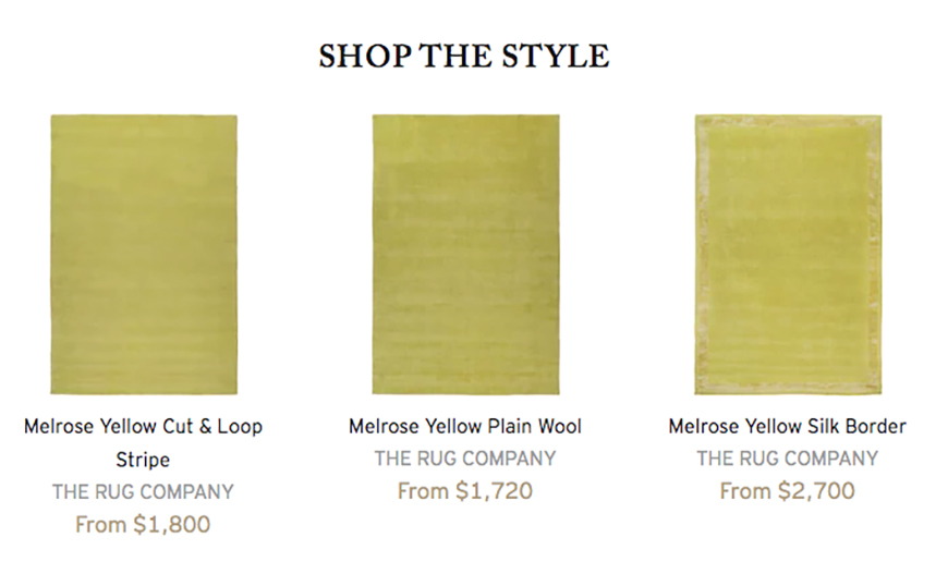
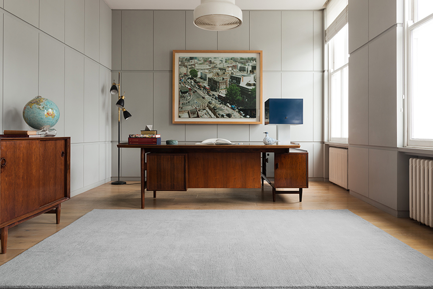 ARCHITECTURAL NEUTRAL: Wizlet
Ideal for minimalist design enthusiasts, this cool grey can bring a modern feel to a room.
Complementary Farrow & Ball Architectural Neutral Paints:
Blackened No. 2011
Dimpse No. 277
Pavilion Gray No. 242
Manor House Gray No. 265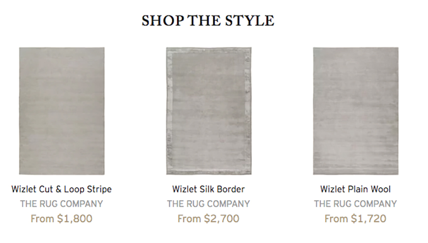
Explore Farrow & Ball in the DDB Suite 1519!
Also join the DDB in Suite 1201 for April’s Designer Forum Series edition, presenting A Look At Design’s Next Generation. On Thursday, April 19 from 5-7 pm A. Rudin hosts Dering Hall’s Executive Editor, Dennis Sarlo in a conversation featuring Spencer Rudin of A. Rudin, Chad Stark, SVP of Stark and designers Ryan Lawson and Alessandra Santopietro.