The Benjamin Moore Color & Design Team annually forecasts color trends following a yearlong research journey. This year, the journey took the team to 30 cities across 12 countries, traveling nearly 100,000 miles to bring you… drum roll please… Caliente! GDG talked to Priscilla Ghaznavi, the Director of Color & Design Studio at Benjamin Moore, about the red-hot color of the year.
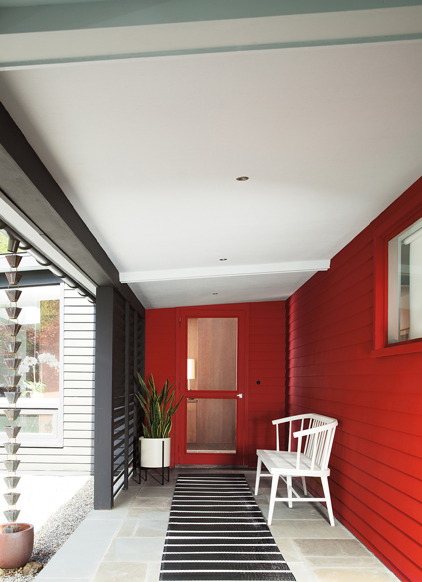
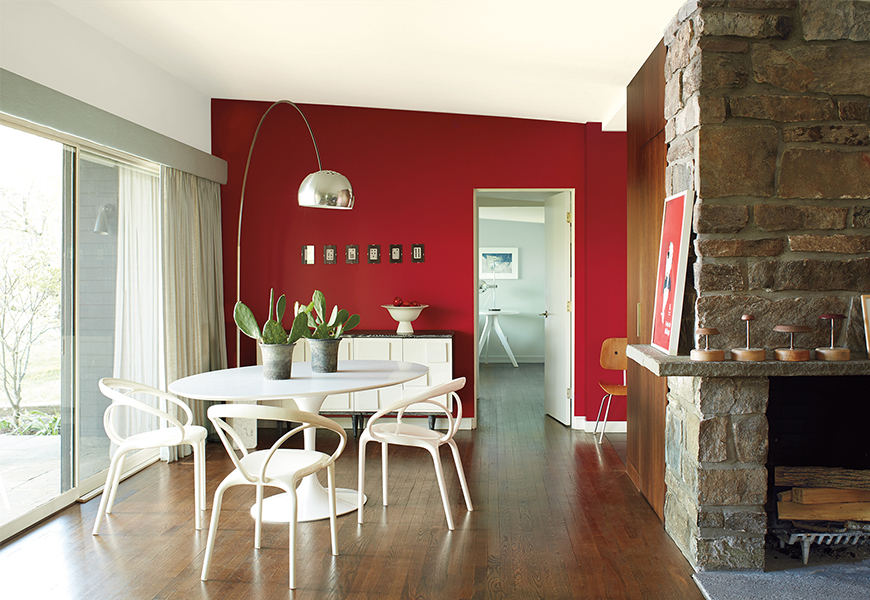
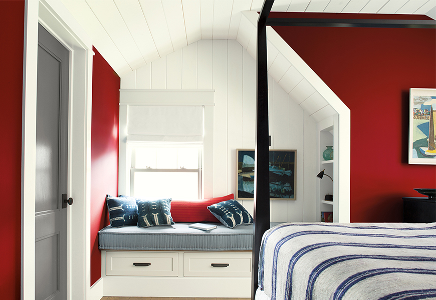
A member of the Benjamin Moore Affinity Collection, Caliente AF-290 works well with many colors, creating spaces that are warm, livable and bold, but not startling. It joins 22 other hues that glide across the spectrum from millennial pink to oxblood. This charismatic red-orange emits energy through its cinnamon undertones that allow it to pair well with browns, neutrals, blushes, pinks and other reds.
Distilling ideas and images from art exhibitions, design fairs and cultural happenings into one color is no easy feat – the team worked tirelessly to narrow down over 3,500 colors. Throughout their travels, red seemed to resonate as happy, smart and dramatic, signifying change and strength.
Some believe that red is the oldest color identified by man, according to The Guardian. In ancient Egypt it was associated with life, health and victory, through primal energy forces like fire and the passionate love and adventure associated with storytelling histories. Now famous ‘red rooms’ found within Carolina Herrera’s apartment, the Ritz Bar in Paris and the red velveteen on Milan’s Gucci flagship walls, offer our modern depiction of interior energy.
Last year’s Shadow was a bold rendition of smoke and midnight, and this year’s Caliente makes statements of its own. This Editor has always worn red ‘to ward off the evil spirits and bad luck,’ thanks to a superstitious and stylish design momma. Others say it’s look at me nature evokes your natural beauty and strength. But, many see red for its commanding presence and strong-will.
Ellen O’Neill, the Benjamin Moore Director of Strategic Design Intelligence, started seeing red first at the January Women’s March in D.C. She looked out on the National Mall and saw a sea of dusty rose and red; she determined “right now, color is voice.”
O’Neill noted more examples from cinema to museums – the red robes from The Handmaid’s Tale at the Emmy’s, the Comme des Garcons show at the MET, and the “Items” show at MoMA.
“Red is total confidence and is a vehicle for expression, which seems to be a common theme in today’s society,” Priscilla said.
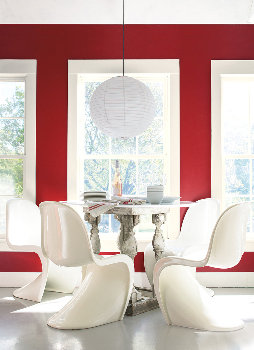
Caliente, used primarily on front doors and living or dining rooms, can also be used in bathrooms or study rooms, for those who are more color confident. For those who aren’t “red-ready” Priscilla suggests using it as an accent, on a door or window frame for an unexpected, but subtle pop of color.
If you’re seeing red, and using Caliente, tag @godesigngo on Instagram for a chance to be featured as our ‘red hot’ spotlight design.