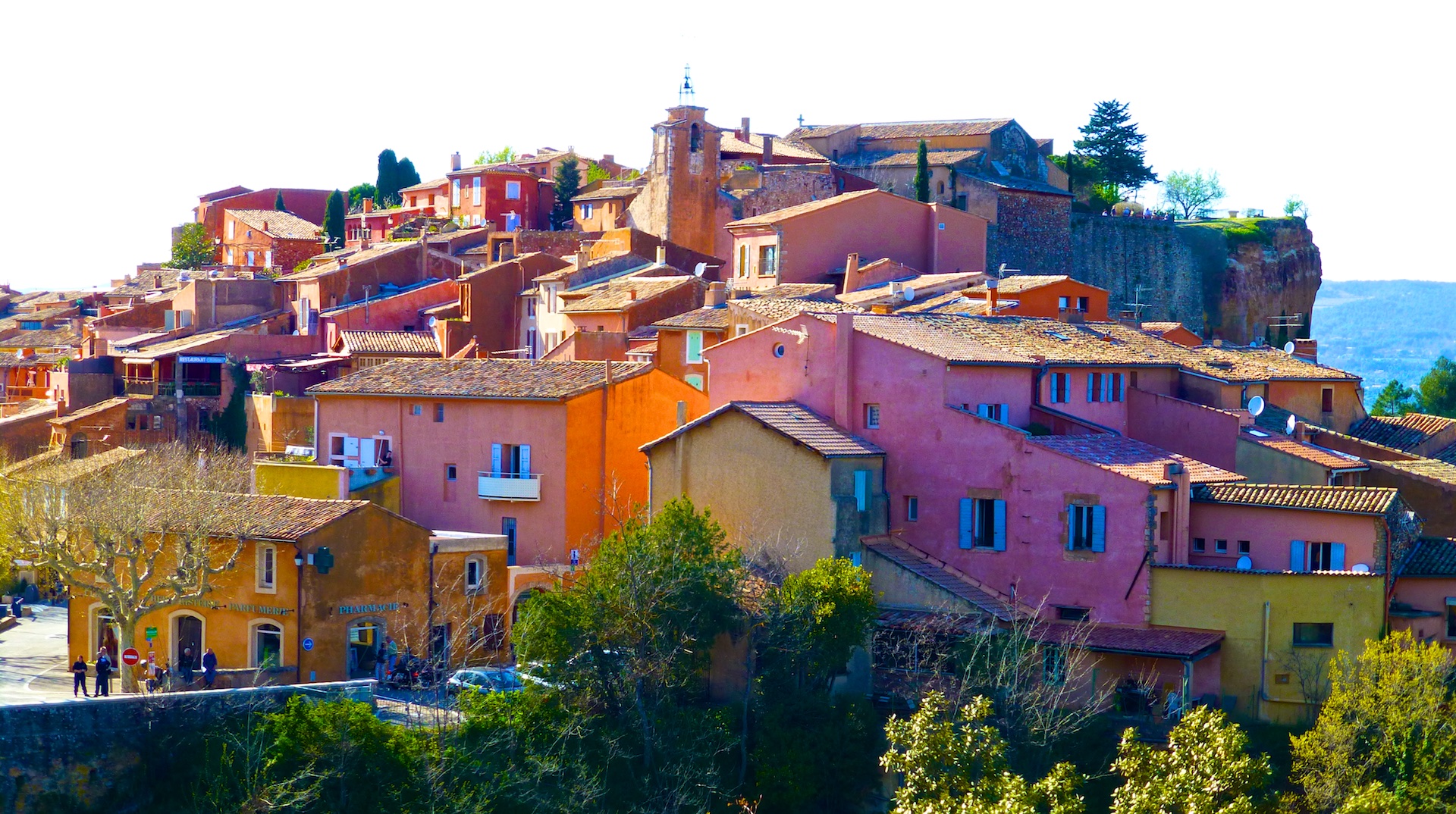
In post-World War II Provence in the South of France, a young entrepreneur with a truck named Frederic Chauvin began selling household sundries, medicine, cleaning supplies and paint door to door. A countryside desperately in need of some restoration and a fresh start, his white lime wash paint was an easy-to-use solution for both interior and exterior applications. A common practice in southern Europe and North Africa was to tap into the rich, bountiful ochre quarries that are indigenous to the region. Mixing the varying powdered hues – from pale yellows and blushes, to burnt oranges and rich reds – with the lime wash paint resulting in an eau forte, or “strong water” which would drenching the Provencal architecture in an array of color, now a signature design element.
From humble beginnings, Frederic’s son André grew the company by opening a factory in Avignon, France, expanding their color library and finishing techniques over the last 50 years. Today, owned by the same family with Daniel Chauvin and his daughter Pauline at the helm, Ressource, is a global brand offering over 1,000 shades of highly pigmented paint colors, complimentary wallcoverings, custom designer palettes and endless possibilities.
According to CEO of Ressource Americas, Julien Chapuis, this was the brand’s turning point. They sought out color experts and influencers from all over Europe to inform their expansion in an effort to develop something truly special. “It’s an exchange between humans. We seek inspiration from fashion, textiles, architectural designs, and nature. There is no limit,” says Julien. The company’s founding pillars, Technology and Tradition, supported by a passion for color, dedication to research, and an open mind make Ressource a standout in the paint market.
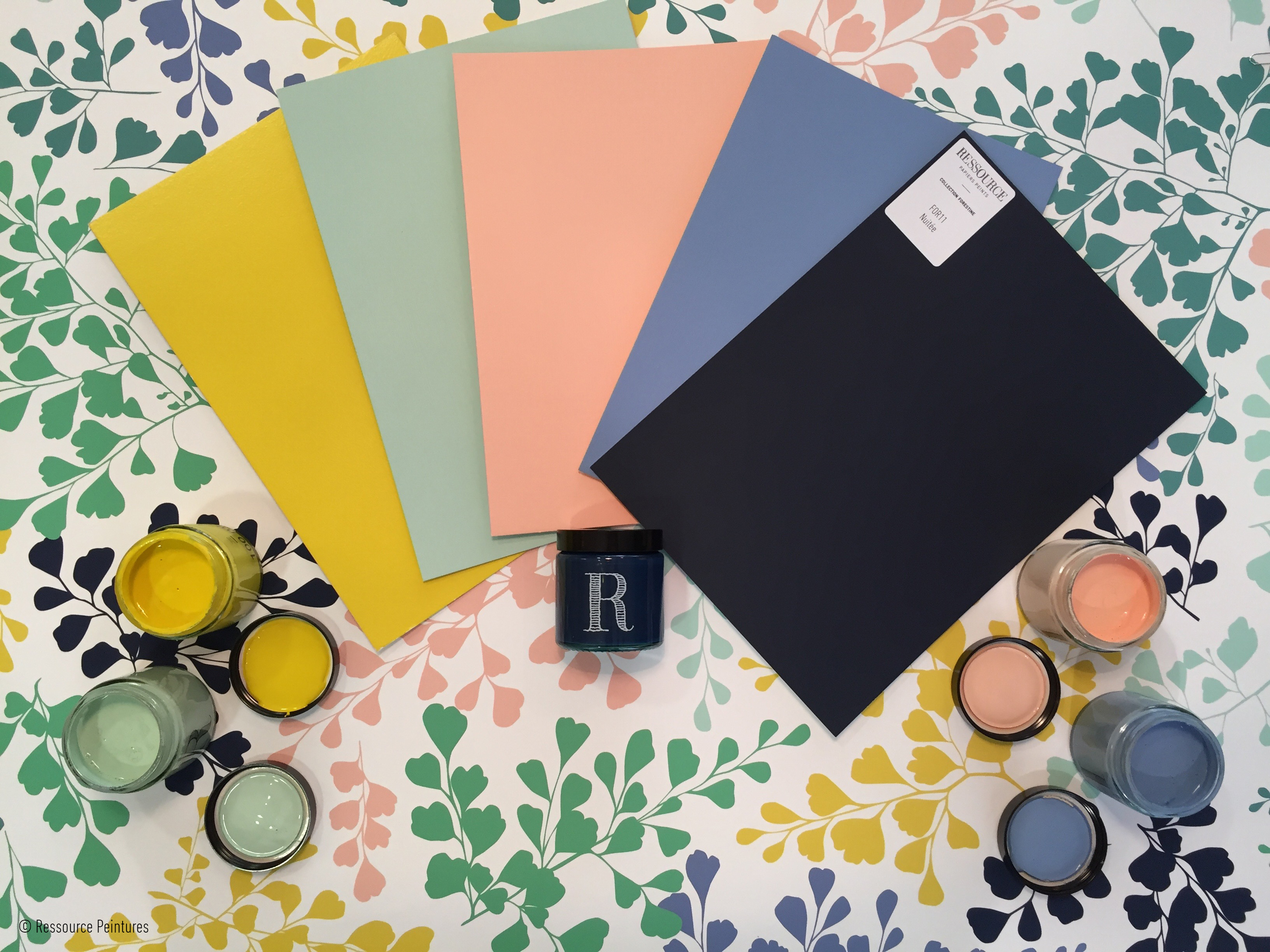
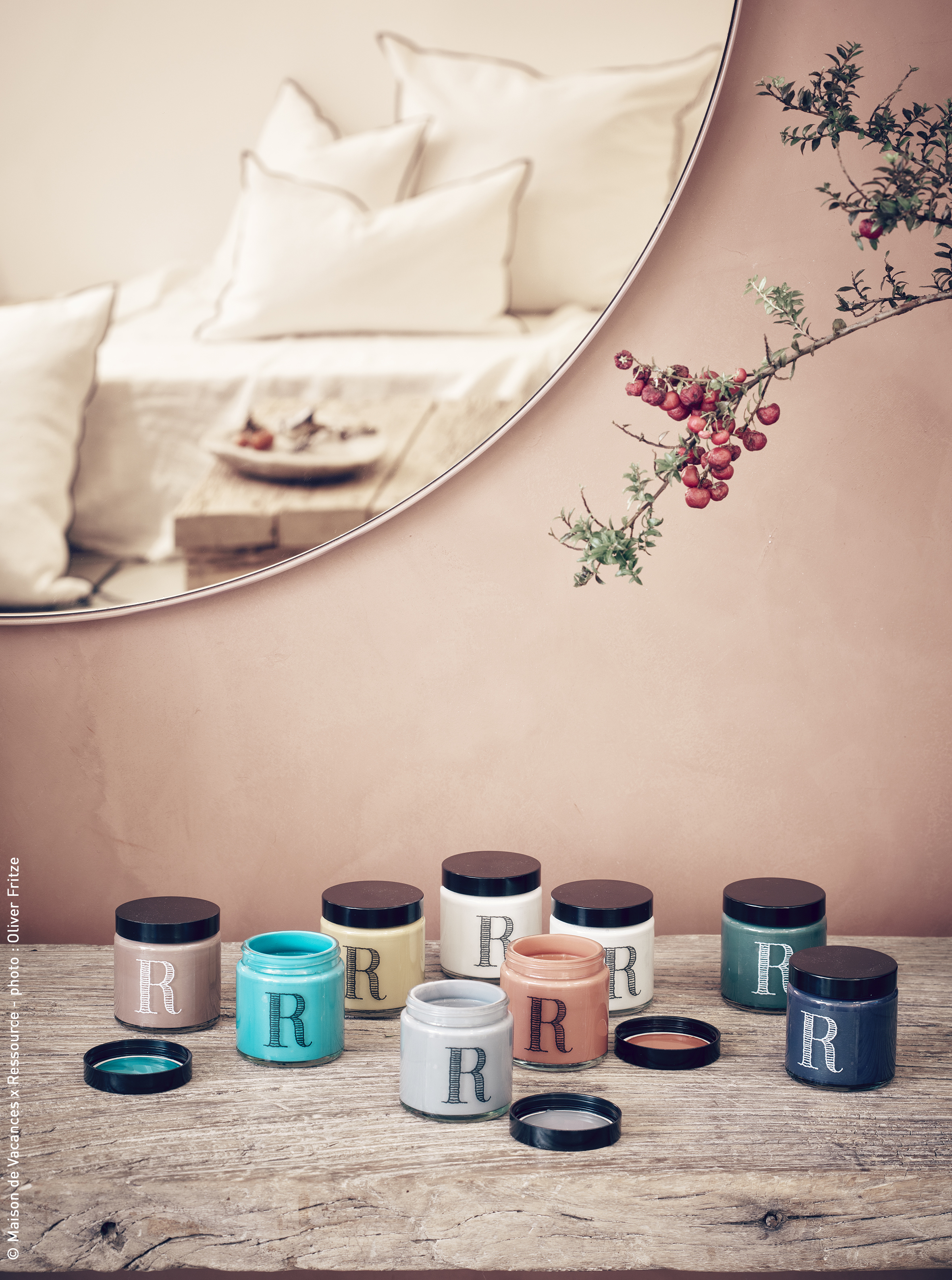
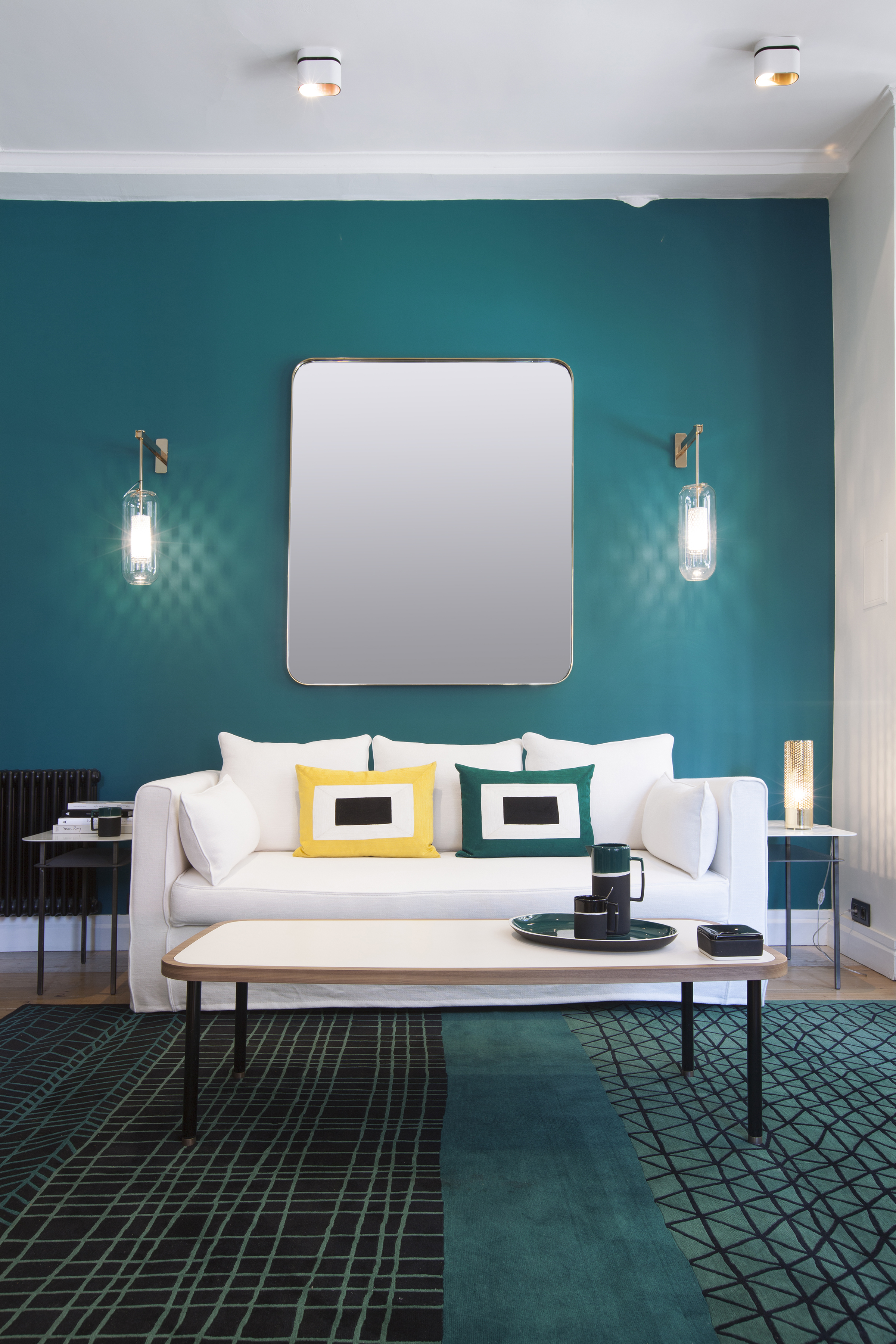
The true hallmarks of the brand are the depths of color and range of effects. There may be 200+ shades of grey… but varying slightly with subtle nuances making each unique. Even their black is not basic; it is comprised of dimensions that give it a sense of complexity. In addition to their vast color library, Ressource has developed and perfected application techniques and products to garner special effects like brushed and burnished textures, a linen-inspired “washed” look with their new collaboration with Maison de Vacances, and the perfectly imperfect limewash which leaves uneven waves of highs and lows.
Chapuis is extremely familiar with the product. With paint-stained fingers from an early morning demo, he points out the distinctions and depth of color. “You don’t control the finish. The lime is always a live product,” Julien explains. He personally demonstrates their signature techniques to painters, both in their raw atelier-like showroom space and even on the job site itself, recognizing the importance of setting and light. He is as passionate about sharing and he is about color. The showroom offers resources to designers and architects including training their preferred vendors or recommending some practiced hands for a job.
Since 2015, Ressource teamed up with an embodiment of Parisian style, Sarah Lavoine. The direct descendant of Polish royalty and the daughter of French Vogue royalty– her father Jean Poniatowski was the pub’s Editor in Chief for almost 15 years – has an eye for color and effortless sense of style. In addition to her namesake furniture company, available at Ressource, she is a designer in her own right, having recently designed the L’Oreal Headquarters in Paris, as well as numerous hotel and commercial projects.
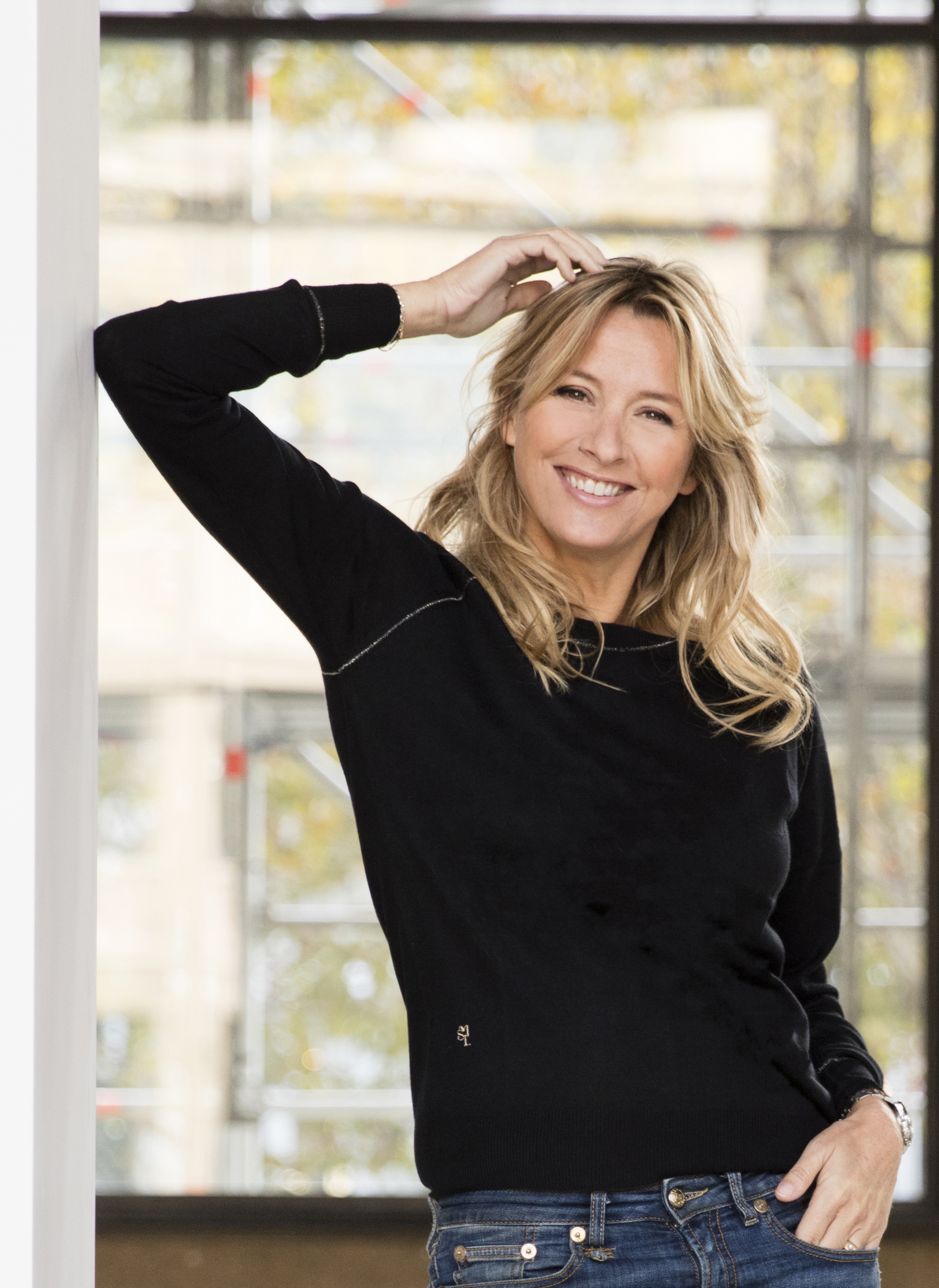
Lavoine partnered with the paint experts to create a personalized palette of signature colors including a hue that has become part of Ressource’s brand. “Color is very personal. The ‘Bleu Sarah’ is definitely her blue,” says Chapuis. The partners decided to make their entrance to the U.S. Market together, with Sarah’s furniture and product outfitting the DDB showroom and her palette as a featured collection among the other designer collabs. The palette development process, crafted with well-known European architects and designers, is an open dialogue, which includes a collection of inspiration images, snapshots of color and favorite design elements, a preliminary batch of colors, followed by tweaking and perfecting. The result is a bespoke palette of signatures colors that represent that individual’s aesthetic perfectly.
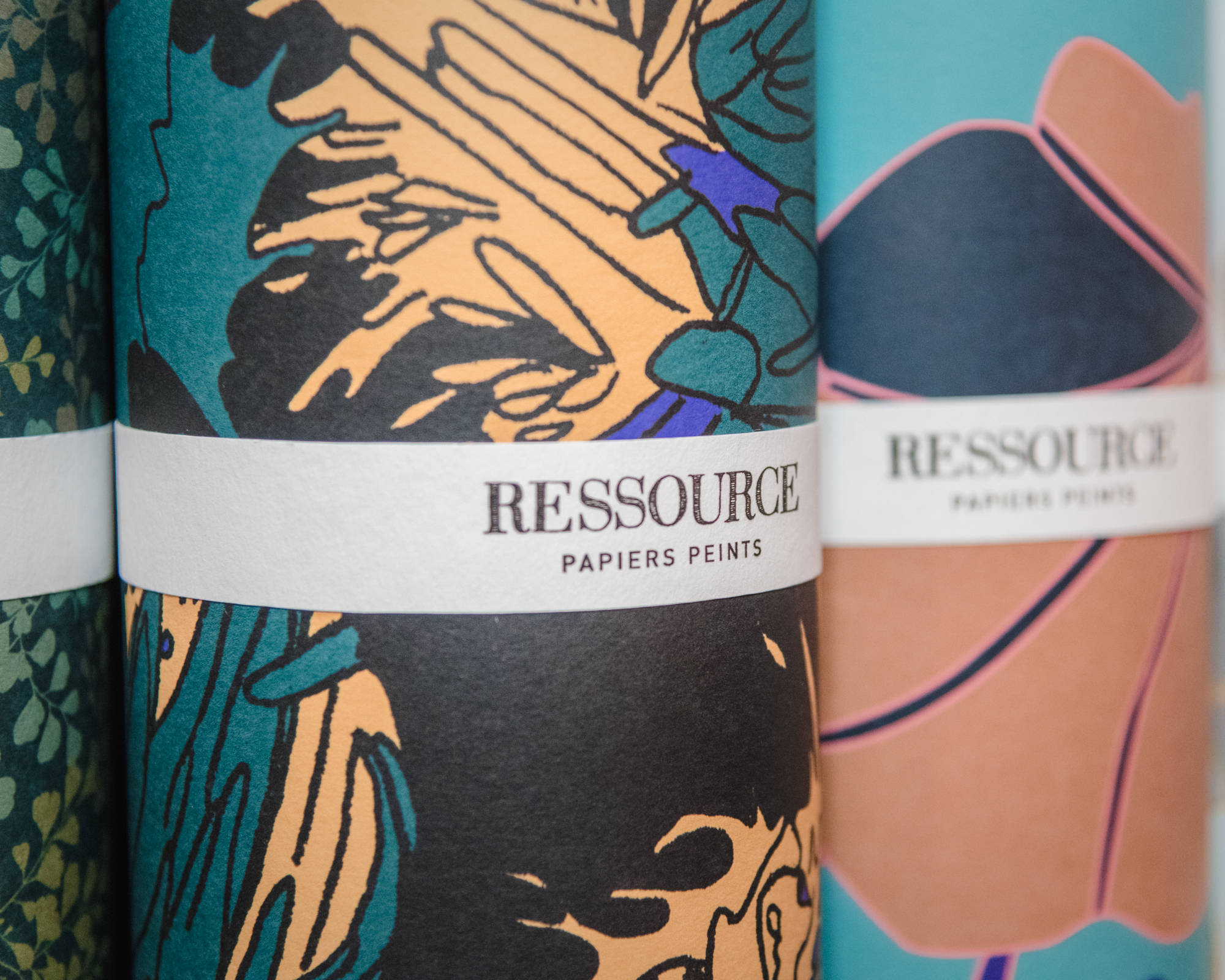
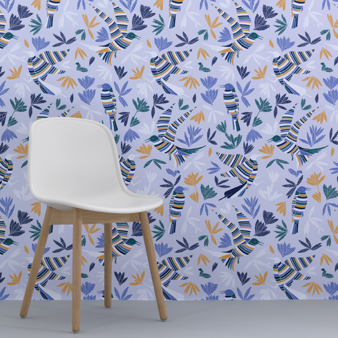
The great-granddaughter of the brand’s original founder, Anabelle Vermont now designs wallpapers, crafted to compliment their paint products. “Inspired by the Provence identity of the brand, each wallpaper features a universal, rich and colorful natural spirit, which pay tribute to flowers, plants, insects and birds, a whole flora and fauna designed in a contemporary style.” She also serves as the store designer, giving the brand it’s overall aesthetic.
The French word ressource is described by Chapuis as “going back to your roots, to your origins”, an intangible, restorative property “from the earth”. This ethos is infused into their brand and product, using eco-responsible vegetable inks and water-based (zero VOCs) paint. Ressource is for the bold, thoughtful, design dreamer seeking a like-minded partner in color.