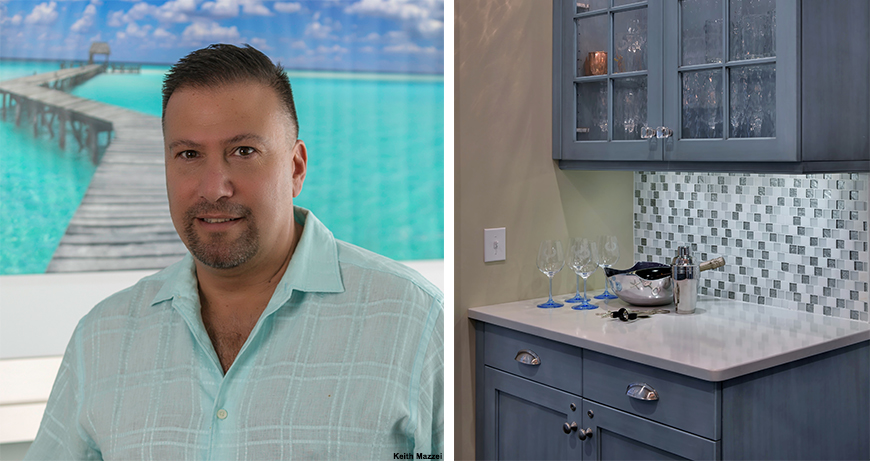
Keith Mazzei has creative design in his DNA and describes himself as the first person into a project and the last person out. By taking care to adorn each space with just the right touches of art and accessories Mazzei has a project base spanning from Manhattan to Montauk (NY) and Miami to Manalapan (FL). But in 2018, one thing ties his concepts together: Color.
Gone are the days of the all-white kitchen, clean in look, but tired in application. Instead, Keith is seeing bold blues and mint to Kelly greens in kitchen and bathroom cabinetry. GDG talked through this trend with Keith:
Holly Speck, Editor: Would you say colored cabinetry is becoming more popular in recent design trends? Why or Why not?
Keith Mazzei: I think that kitchens have become so large that people don’t want to do a sea of just one color. Twenty years ago, kitchen cabinets were well-equipped if they included a lazy Susan and built-in spice rack, now storage options are plentiful and customized.
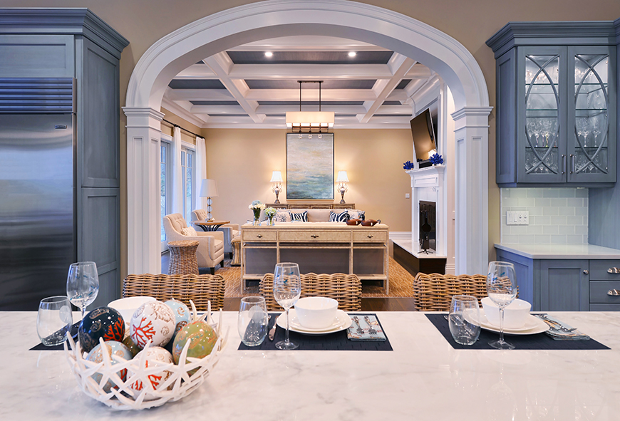
They want to break it up with more colors! Even in a small project a little pop of color goes a long way. Colored cabinetry is definitely making a hit. Grey is not a color, so this Blue and Green is very welcome and can still act as a nice neutral or compliment to stainless steel and other uses of whites and greys.
HS: Name some material trends you also see for kitchen cabinetry in 2018?
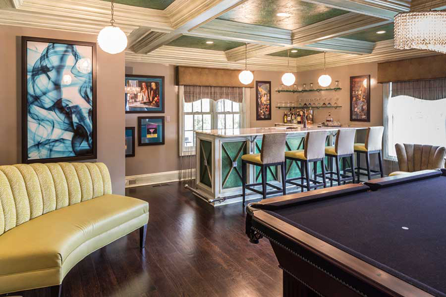
KM: A lot of wood. We are seeing live edge wood tones on top of the island or peninsula in a bar area. The top wood tones are a Walnut or a Brazilian cherry, something with a lot of tones in it and not just one coloration.
HS: Where else do you think we will see unexpected pops of Color?
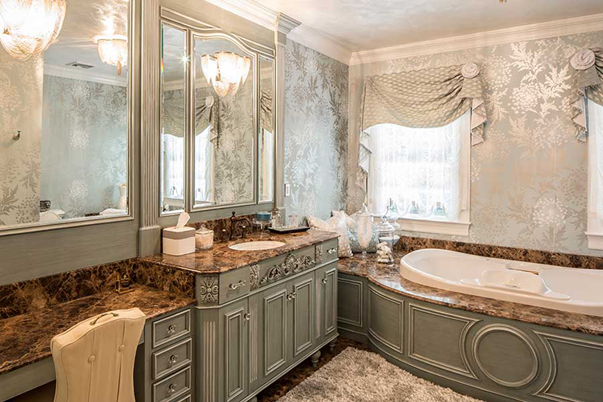
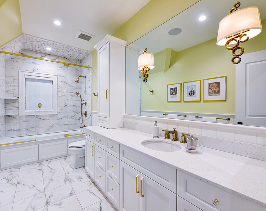
KM: Definitely in the bathrooms with tile and tops for wet rooms. It takes awhile to get away from white and grey and we don’t want to get rid of them for good. We need to keep the staples, but maybe it’s just a fun tile or bench seat or vanity that weed out white and grey and add that fresh pop of color.
HS: Is there any paint or finishing color you’re crushing on now for kitchens?
KM: This particular project used a Robins Egg Blue from Benjamin Moore, but I’d really like to see the rise of more purples. Last year the Benjamin Moore “Shadow” color of the year was such a rich plum, but I didn’t see it filter into design elements. I would really like to see that filter in some warmth and elegance to kitchens and bathrooms.
HS: What are your tips for infusing pops of color in a project where a client may want monochromatic?
KM: Don’t be afraid to use color because it adds so much to the space. Try to work it in accessories or a backsplash or lighting. It’s something you can always change and aren’t married to for the entire shelf life of the kitchen, so you can do it minimally and get that pop, but you’re able to switch it out if you need to.
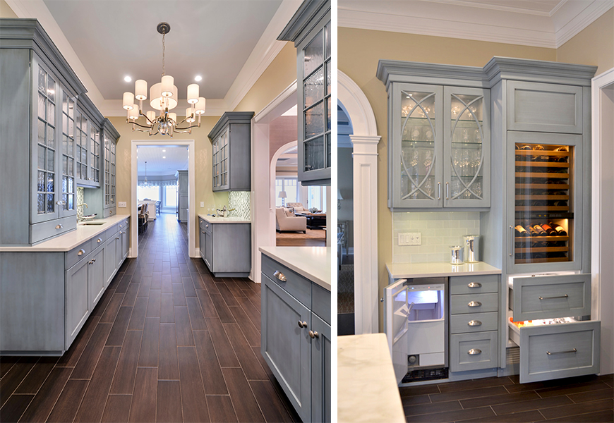
I recently had a client out east and she thought she wanted an all-white kitchen and butler’s pantry, but when I introduced the pop of blue she was ecstatic with the finished product. The blend of the wood floor and blue cabinetry color offered a nice clean feel for the home. Ironically, blue warmed up the space, even though usually it’s a cool color.
It wasn’t that she wanted the white and grey kitchen per se, it was that she thought she should have that kind of ‘clean,’ classic kitchen.