Each year’s Kips Bay Decorator Show House is full of elegant salons and spacious bedrooms and dining areas that lend themselves to grand decorating. But not every designer chosen to participate gets such a lucky assignment. And sometimes, smaller spaces and awkward proportions generate the most design ingenuity.
Here, Young Huh, DDB Spring Market panelist, tells how in 2014 she transformed a freight hallway and two commercial bathrooms into a high-style lounge with powder rooms for ladies and gentlemen.

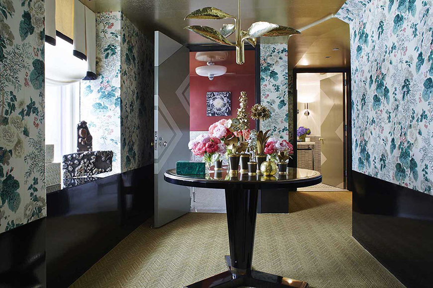
Ours was a daunting task because of the awkward space, metal doors, low ceilings, crooked walls, and horrible commercial materials. We resolved the design problems first by upholstering the upper 3/4 of the walls in a beautiful chintz, covering the bottom third in black patent leather. This allowed us to straighten the walls, hide a couple of closets behind the upholstery, and create instant architecture. But we still had the problem of a low ceiling. There we applied a luminous gold-leafed wallpaper, which we paired with a golden sisal floor covering. The gold underfoot and on the ceiling made the room seem to float, and let you forget for a moment that our ceiling height was just 7 feet. A golden vintage chandelier over a center table also helped by providing a focal point that was welcoming and gracious. What to do about the industrial fire-grade metal doors? We weren’t allowed to replace them, so we painted them with a fun graphic design. Again, pattern makes you forget the true nature of what you are looking at. Wrapping the pattern around all sides of the door means you never have a chance to think that this is an ugly metal door as you open it. Instead, you enjoy how the pattern moves from one side to the other. Photos: Ngoc Minh Ngo.

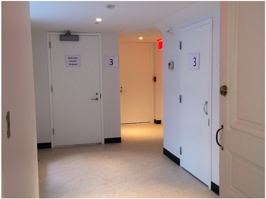
The industrial hallway as it originally appeared, with bathrooms behind the two rear doors.

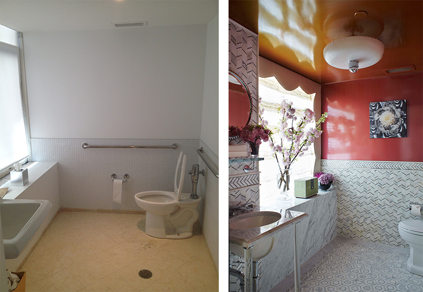
(Right) The women’s powder room. For the baths, we installed luxurious mosaic tiles, high-end fixtures, and new toilets (of course)! Treating the walls with a high-gloss faux finish and wallpaper instantly created glamour. (Left) The bath before its redesign.

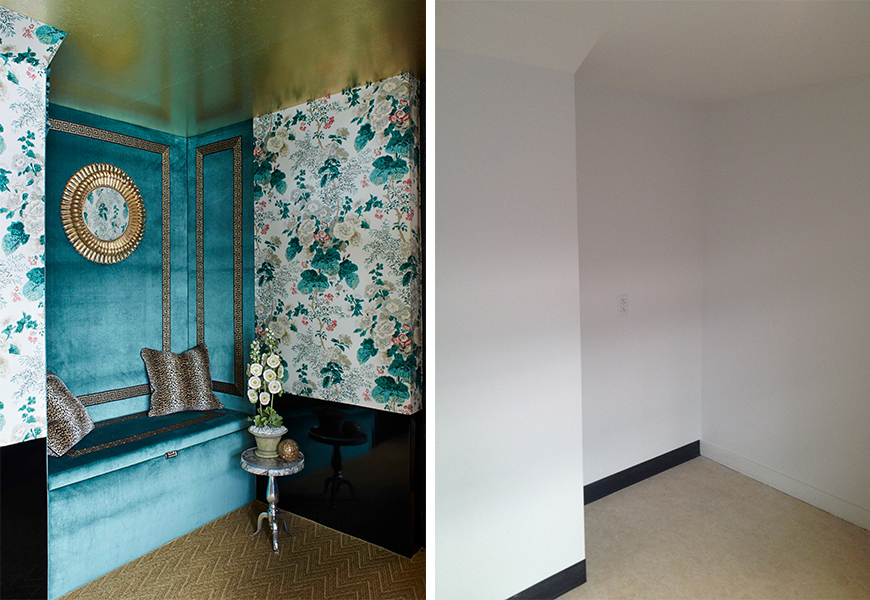
(Left) A crazy, nonsensical jog in the wall? We took advantage of the indentation to build a cozy seating nook. Upholstering the walls in green velvet with Greek-key trim helped define this as a separate little get-away space, and made it look purposeful, instead of an architectural mishap. (Right) The awkward, leftover space before its transformation.

