When Architect and Designer, Neal Beckstedt stepped into a recent project he thought he was offering simple advice on paint colors, but eventually, this advice would snowball into a complete gut renovation.
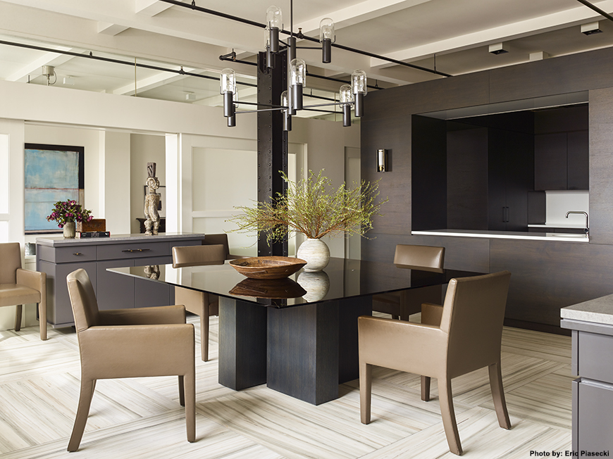
A single gentleman lived in this light-filled Chelsea loft that had not been renovated since the 1980s. After living in the home for over 20 years, you would think one would become reasonably settled and attached, but Neal describes his client as relaxed and receptive to a series of cosmetic updates.
“He saw the value of what we suggested and he kept saying ‘yes’,” Beckstedt said.
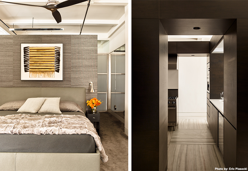
A generous coat of White Dove paint by Benjamin Moore was the first step in designing this gray-hued bachelor pad, that’s anything but boring.
“I could tell very early on that he loved gray and darker accents, but it’s all about contrast,” Beckstedt explained, “The client was loving dark and moody, so the idea was to keep the dark masculinity of the space without making it a cave and keeping it light and airy.”
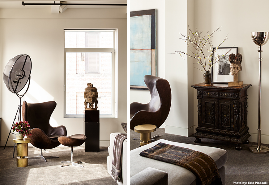
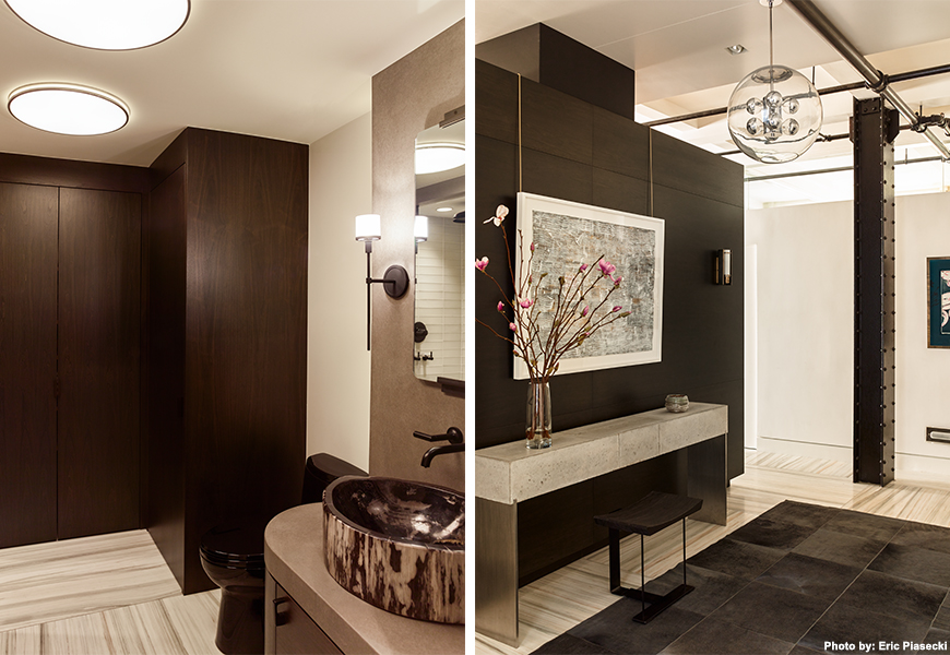
The fix? A very tight palette of grays and woods to create consistency, while infusing interest and personality with a variety of textures. A walnut high gloss wood grain and patterned Hemp wallpaper by Phillip Jeffries were some of the screws that tie this mancave together. Neal also shied away from making it too “fifty shades”.
“Gray works so well with brown. It warms up the tones and the design to keep the space from getting too cold and chilly in subtle movements. Some brown suede on the outside mixed with smooth leather elsewhere, adds some detail and depth, while not straying too far in the color family,” Beckstedt added.
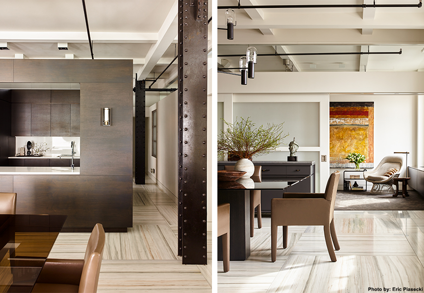
As Neal slowly created a new life for his client’s lived-in loft, his bachelor started getting excited. “Once he saw where it was going, the thought became, ‘While we’re doing this, let’s make sure it’s set for another 20 years,” Beckstedt said. Soon everything, but the great, square and symmetrical floor plan was out!
Besides a fridge full of beer, Beckstedt also explained the specific needs for designing a bachelor pad. In this project, masculine textures such as a gray cowhide rug by Edelman leather adds depth to the space and a Holly Hunt mohair zigzag sofa adds a subtle play on a traditional sectional. But, most importantly each of these objects creates a comfortable atmosphere for socializing.
“When designing a home for a bachelor, you need to think about the specific kind of socializing,” Beckstedt said, “In any space you must think about this whether it be for a kids party or a cocktail party, but for a bachelor pad you have to think flexibility. You have to create spaces that are comfortable for the person to watch TV alone, or have people over for the big game.”
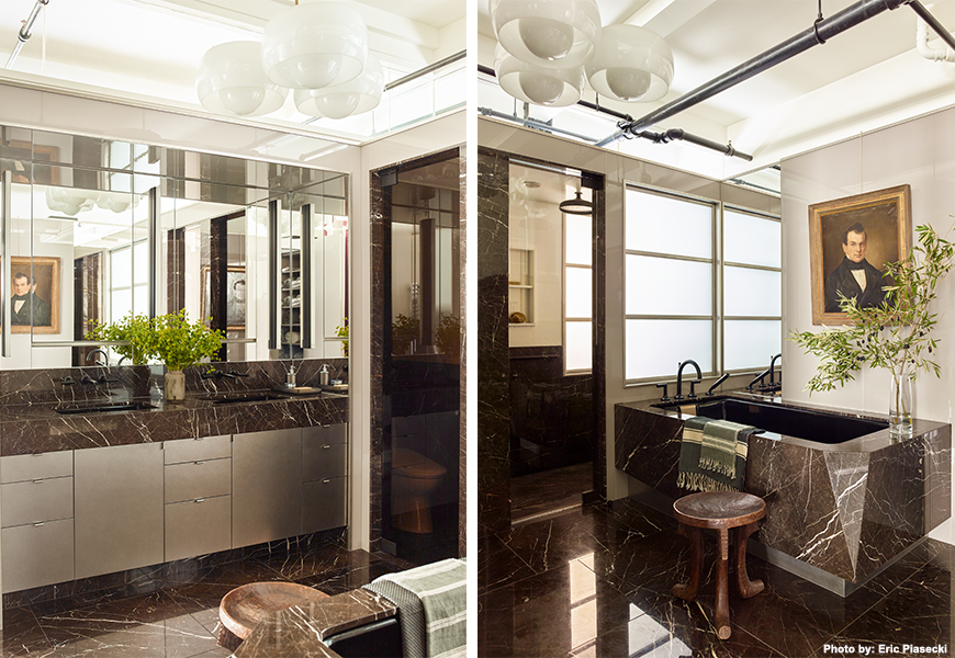
Additionally, Beckstedt cautions designers working with bachelor pads to be careful and cognoscente of using contrast and staying balanced. Where there is high-gloss, there must also be matte. Where there’s black, there must also at least be gray.
