Neutral Playing Field
“Ask yourself, as children grow out of their beds, share with a sibling or move rooms, could their ‘old’ room be adapted as a study or even a dining room? Little one’s needs change so much and so quickly, it really makes sense to go for a scheme that is multi-purpose, but most importantly, timeless.”
-Miranda Vedral, Interior Blogger
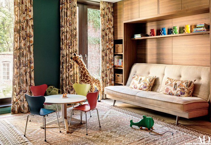
Interior Designer, Lauren Santos, decorates her NYC Townhouse features neutral bedroom playroom, with subtle pops of color and natural material. Teak cabinetry pairs nicely with the Clarence House fabric hanging as curtains and as sophisticated jungle pillows.
“Kids are a great joy of family life, but one thing that can be difficult is decorating a bedroom of someone that grows so quickly before your eyes! My top tip for decorating kids bedrooms is to keep things simple, kids change their mind and get bored of a lot things very quickly!”
-Sarah Hayford, Interior Blogger
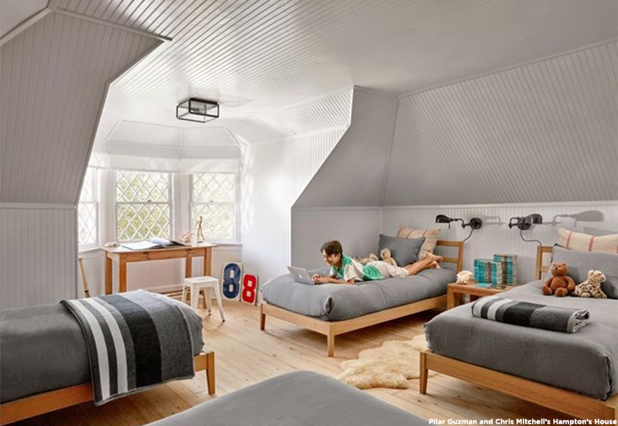
Pilar Guzmán and Chris Mitchell outfitted the kid’s room of their Hamptons weekend home with a set of four Muji beds, chromatic hues and Ralph Lauren Home sconces for a child-friendly space that’s cozy, airy and classic.
Children’s Classics
“Blue is a stimulating color for a toddler and not too insipid for a teenager – and not gender-specific. I painted my nephew’s room in it, and my niece wants to swap rooms with him.”
-Libby Cameron, Interior Designer
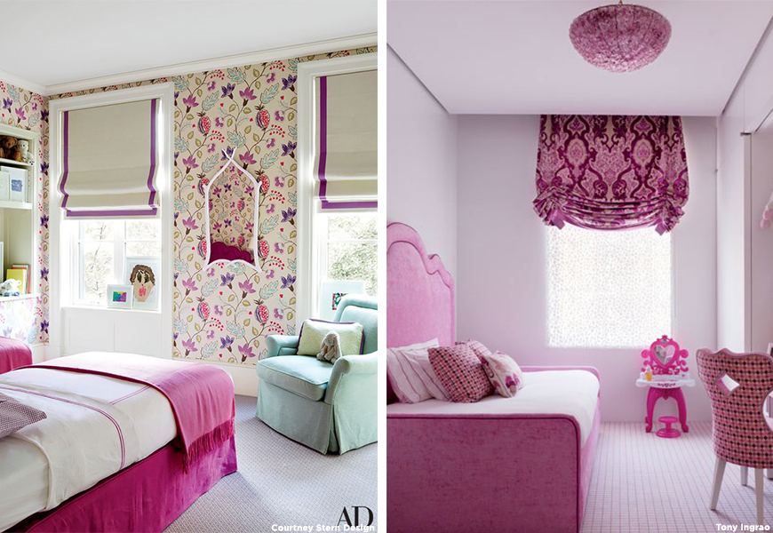
Although the world is changing, there is something so charming about classic children’s room colors; shades of pink and blue, be it for a boy or girl! This child’s room (left) is pretty in pink with a vivid Osborne & Little wallpaper in the New York home of Nicholas S.G. Stern and his wife Courtney, an interior designer. This room by Tony Ingrao and Randy Kemper (right) is awash in pink with fabrics from Osborne & Little and a plush Stark carpet.
“It’s funny how kids attach themselves to color. A four-year-old boy wanted blue, and I chose a saturated blue with a bit of sky and smoke in it, so it had some sophistication. Then we chose furniture to grow into – a Moroccan rug, African textiles in browns and tans and whites, a Lucite desk chair. Five years later, it still works.”
-Timothy Whealon, Interior Designer
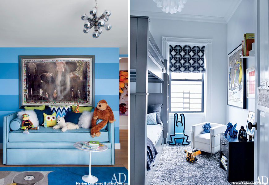
Music icon, Sir Elton John turned to designer Martyn Lawrence Bullard to make his Beverly Hills home family-friendly. The boldly striped wall, featuring alternating Benjamin Moore blues, is accented by a ‘jack’ inspired chandelier (left). A Knoll Saarinen side table and pile of stuffed animals complete the cute and cozy nook. On the right, Neil Patrick Harris and David Burtka, keep things playful with pop art and a geometric DwellStudio for Robert Allen roman shade.
Bright and Cheery
“Children’s bedrooms should be fun, bold and playful. As a designer, I love to let my imagination run wild when working with children’s bedrooms. Children love to have their own special space and creating a reading nook or hiding space allows them to escape into their own magical world. Go on have some fun!”
-Lauren Gilberthorpe, Interior Designer
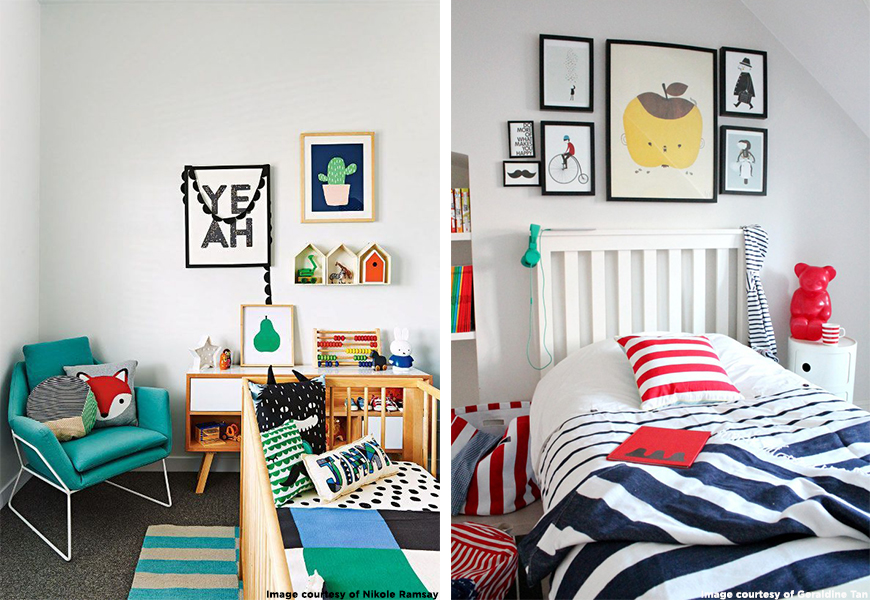
On the left, clean white walls and pops of soft color make this nursery light and happy. Bold illustrations and Scandinavian style furniture seamlessly incorporate vintage toys into the simple, yet sophisticated scene. The left takes a slightly different, yet equally graphic approach with high contrast primary colors, highlighting the mix of stripes in Geraldine Tan’s cheerful kid’s room.
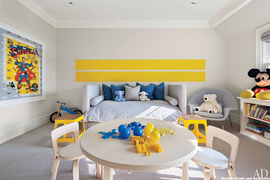
Shelton Mindel & Associates also add pops of red, blue and yellow. Benjamin Moore yellow racing stripes make a statement in this chipper children’s room. Knoll’s Eero Saarinen Womb chairs creates the perfect moment for little ones to curl up with a book.
Fun and Funky
“Personally, I like a child’s room not to have a theme, instead adding decorative touches, so that they can grow with the room. I tend to always steer towards bright pastels and pattern for children, I think it brightens a room and makes them feel clean, but cool at the same time.”
-Kara Janelle, Interior Blogger
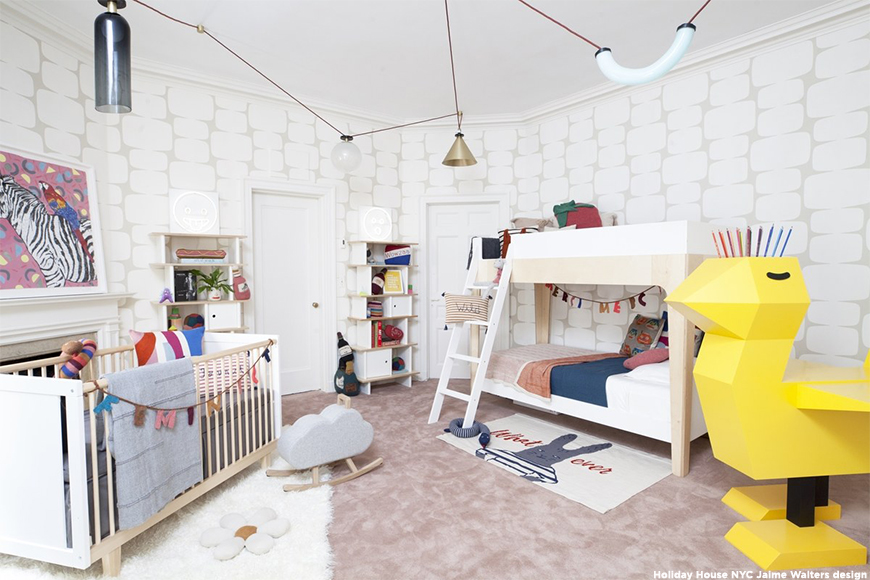
This year, Jamie Walters designed Holiday House NY’s first-ever kids’ room, with a nod to her own childhood. The holiday: Throwback Thursday. The giant duck desk: Kinder Modern.
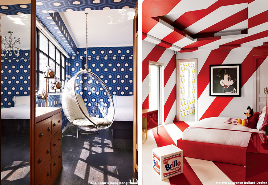
On the left, accessories designer, Fiona Kotur outfitted her son’s room in their Hong Kong home with a suspended Eero Aarnio Bubble chair. David Hicks hexagon wallpaper by Cole & Son, available at Lee Jofa, makes the room youthful and modern. On the right, an Andy Warhol “Brillo” box and Mickey Mouse print welcome you to a candy striped room within Tommy Hilfiger’s Miami home, designed by Martin Lawrence Bullard. The walls are painted with Benjamin Moore’s 2018 Color of the Year Caliente red and the bath features a scratch-and-sniff banana Flavor Paper wall.
Smart Storage Solutions
“No matter your child’s age, they’re going to need storage! I like to think about storage in several layers or levels. I love having proper closet storage and dresser/drawer storage. But, keep in mind some super-easy storage like lidded (or open-topped) baskets or trunks. This last level of storage is perfect for everyday items that need to be tucked away at times, but all need easy access.”
-Scot Meacham Wood, Interior Designer
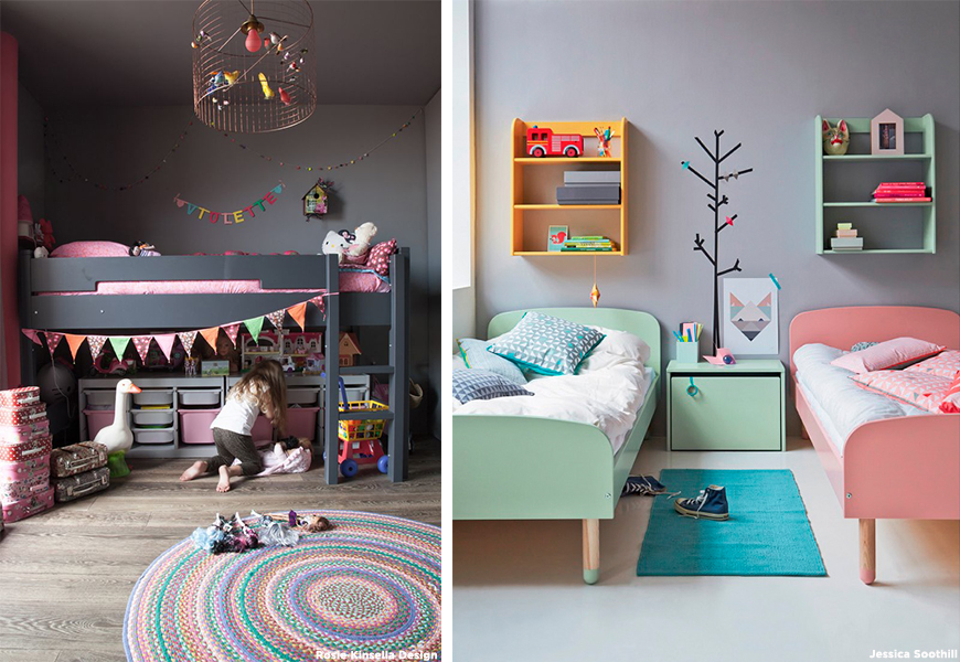
Designer Rosie Kinsella says the key to successful children’s bedroom design is clever storage. The baskets, trays, and cupboards below this lofted bed leave more space for play and creativity, and less chance for mess (left). On the right, a shared bedroom offers accessible shelves for toys. The simplicity of the design makes for a room that looks complete and tidy, even with little Converse on the floor.
Mid-Century Movement
“As a Mid Century design geek, I love the simple wooden mobile hanging above the cot. I also love the idea of having photography of baby animals in a kid’s room; it’s just the right amount of cuteness whilst still feeling a little grown up. A great balance of mature style with cute elements can be easily adapted as the child grows up.”
-Nancy Staughan, Interior Design blogger on Amber Interiors’ space
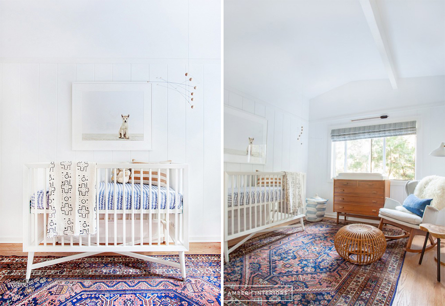
The calming and clean atmosphere that Mid-Century instills is the perfect feeling to evoke in a child’s room. L.A. based Amber Interiors, introduces a flair of Middle Eastern textiles and a Persian rug that conjures the sense of travel and adventure. This highly coveted look can be interpreted to fit any style and truly grows with your little one.
Black and White
“When it comes to children’s décor, my eye is always drawn to white, airy rooms with playful details to add warmth and color. Whilst monochrome is the trend of the moment, it can be surprisingly tricky to get it right. The key is to find a balance and you can do this by adding in more soft tones and textures such as, wooden accents, a fun wallpaper or contrasting prints.”
-Steph Withers, Founder and Editor of Chalk Kids
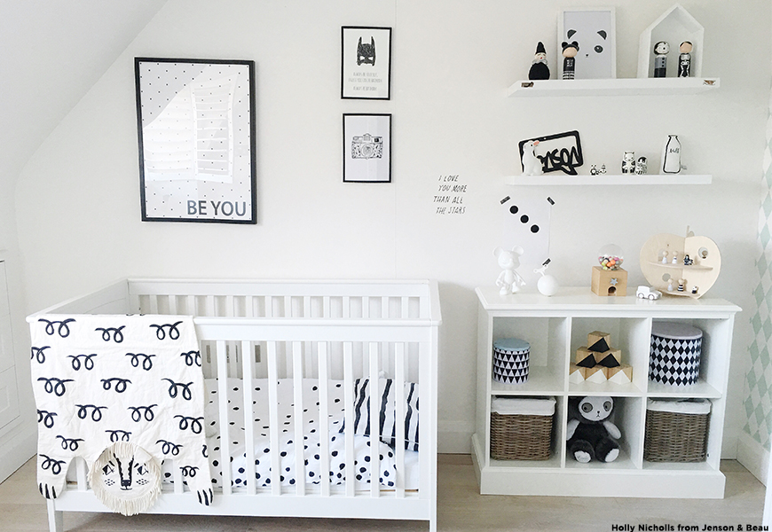
A gender-neutral nursery with special touches is easy to achieve with a black and white look. Although monochromatic, the nursery doesn’t come off as overly coordinated due to unique patterns and pint-sized toys. For a room that can grow with your child for years to come, black and white interiors offers sophistication and style, without diminishing fun.
