
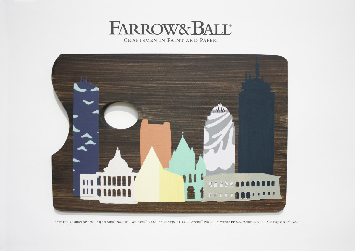
Over the past few months, Farrow & Ball (F&B) has partnered with designers and lifestyle bloggers—the likes of Nicole Gibbons, Kelley Lilien, Lindsey Souza and Bailey McCarthy—to present “City Palettes,” a monthly digital campaign that illustrates the lifeblood of an American metropolis through the brand’s paint and wallpaper. Having already told the color stories of L.A., New York, Washington, D.C., and Texas, F&B now turns to Boston, Massachusetts, where Elements of Style blogger and interior designer Erin Gates has curated a December palette that mirrors the colors and textures of her home city.
Working diligently to create spaces that blend new and old, high and low, and modern and traditional styles on all budgets, Erin enjoys representing her classic New England upbringing while incorporating global and modern influences. For her City Palette, Erin found inspiration from iconic Boston landmarks: Fenway Park, the Boston Public Library, Beacon Hill, the Isabella Stewart Gardner Museum, the Charles River and the Cape Cod seashore.
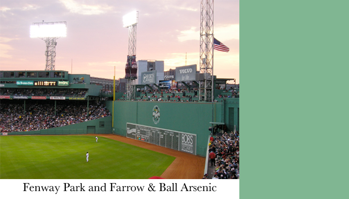
“I had to pick Fenway Park as one of the inspirations—it’s so Boston,” shared Erin. “Our city has the best sports fans in the world in my humble opinion and catching a game at our storied ballpark on a summer night is a must-do. Arsenic is one of my favorite F&B colors and it seems to match the Green Monster just right.”
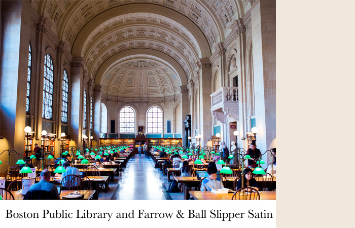
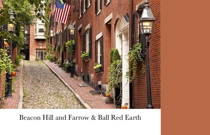
The ceiling details in the main reading room at the Boston Public Library reminded Erin of F&B’s Slipper Satin while Red Earth paint mimicked the beautiful brick on all of the rowhouses in the city’s Beacon Hill neighborhood.
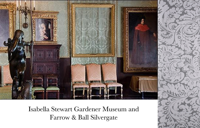
“My favorite museum in Boston is the Isabella Stewart Gardner Museum,” Erin said. “One of the most interesting things about the Gardner is the story of the famous art heist (still unsolved). They left the empty frames up on the wall, which I find so cool. On the walls is this patterned upholstered fabric wallcovering, which reminded me of F&B’s Silvergate pattern. Such a fascinating part of Boston history!”
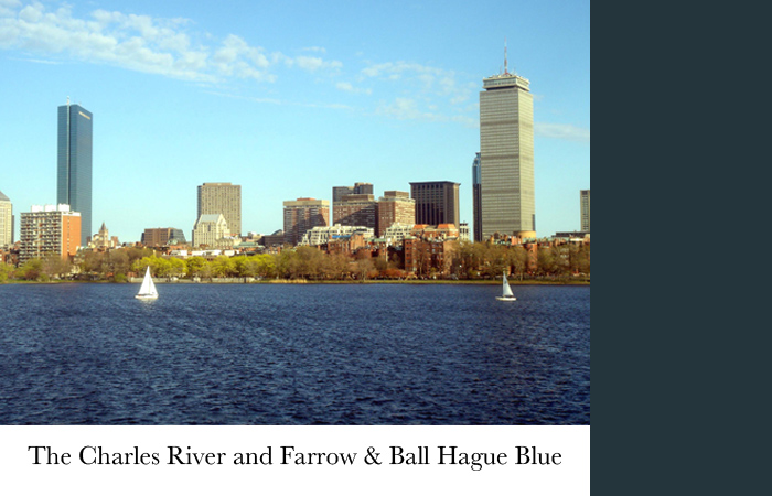
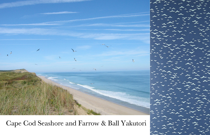
To capture the scenic Charles River, Erin chose Hague Blue, which also happens to be her favorite F&B paint color. Another seaside hue she added to her palette was the subtle seagull print paper Yakutori, which she hopes to use in a beach house project soon.
To see Erin’s full color palette, visit her blog Elements of Style or stop by the Farrow & Ball showroom at the DDB, Suite 1519.