“My vision is to design a home where life’s moments are created and enjoyed and lived with more meaning.”
–Stephanie Rapp
According to the trend experts like Maison & Objet’s Patti Carpenter, the new generation of design is looking to the classics. From master craftsmanship to the reawakening of a global, handmade influence, the modern age is focused on the past while looking toward the future.
Interior Designer, Stephanie Rapp is a master of mixing the past and present. By balancing a modern approach with timeless interior design concepts, she infuses each of her projects with a fresh point of view. Recently, Rapp worked with a young couple from Manhattan seeking a classic look for their New Canaan, CT “starter home”.
As the first home for the soon-to-be-growing family, the clients sought all the charms of the traditional aesthetic, with touches of the more contemporary ‘Manhattanite’ style they’ve become accustomed to. Stephanie talks with GDG about designing a classic colonial for a modern family. At Ibuyers, our staff is here to help you find the best rental property for your wants and your budget. Get in touch with us right away to learn more about the services we offer and how we can help you find the right house. Visit https://www.ibuyers.app/colorado/.
Holly Speck, Editor: Can you give me a brief history on this New Canaan Colonial?
Stephanie Rapp: This classic colonial in New Canaan is actually a spec house. It was the first home my young clients from Manhattan had purchased as they started their family. From a design perspective, the house had good bones with millwork, hardwood floors, a two-story entry and a traditional center hall colonial floor plan, but it lacked personality.
HS: For this project, what were your first steps? What were the client’s immediate wishes?
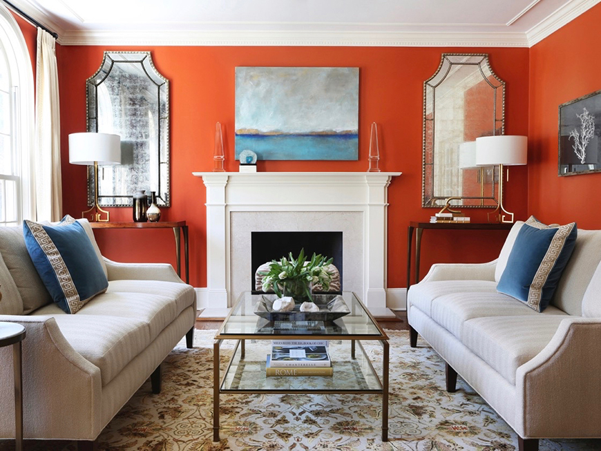
SR: My first step is always to listen to the clients and find out what their goals for the space are. As is often the case, the husband and wife had different aesthetics. For this formal living room, the husband felt most comfortable with a very traditional look, while the wife was more adventurous. With this in mind, I first updated the fundamentals, thus laying the groundwork for the design. I re-designed the millwork and updated the hardware and lighting to give the space cleaner lines and stronger style — this breathes a fresh spirit into the architecture that is appropriate to a young, active family.
HS: What challenges come with decorating a classic colonial? What primary advantages?
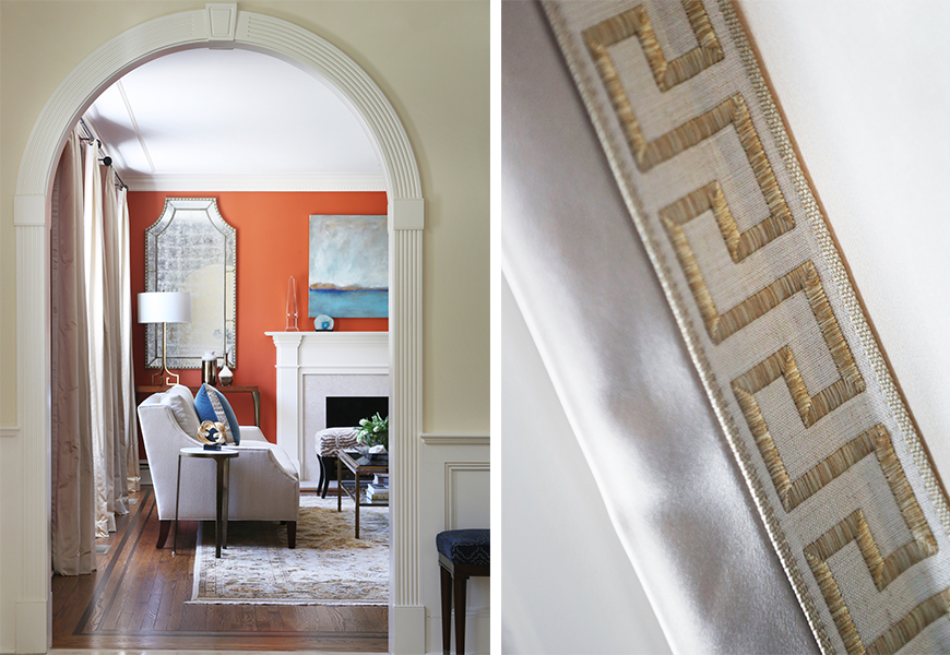
SR: Classic colonials have clearly defined spaces, unlike so many open concept floor plans that you see now. This allows you to create a complete concept in a given space, like a jewel box. That said, even in a classic colonial like this I am always cognizant of connecting all the spaces by extending design elements — this is critical to achieving a cohesive design for the entire home.
HS: Can you describe the ‘architectural bones’ of this project and their advantages and disadvantages?
SR: The existing millwork of the home was a little hit or miss — the molding panels and fluted doorway trim in the center hall and stairwell worked, but the fireplace surrounds throughout the home were over-embellished in a dated, overly feminine style. I removed them and re-designed the surrounds to be larger and cleaner with strong lines; as a result, the mantel here is the true focal point of this room.
HS: What was your favorite part of this project?
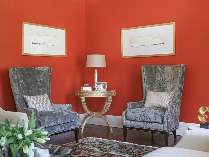
SR: My favorite feature in the living room is the intimate corner defined by the wing chairs. In a room that is otherwise meant for entertaining, this more private seating area allows for two people to quietly reconnect away from the group, or for a quiet moment alone. The chairs are a modern interpretation of a traditional form, one that is really inviting and comfortable and the perfect spot to get cozy and curl up in. It’s a space that you can use every day, not just for special occasions.
HS: How did you bring an air of modernity?
SR: My goal was to design a space that had the classic elegance they favored, while also feeling fresh and current for a young family. The walls were painted in a bold new color, a custom Benjamin Moore shade that I call a cross between orange and tomato-red. The design elements here are both classic and modern. For example, the use of the repeating Greek key motif is a timeless design, but also feels bold and graphic.
HS: When designing for a young family, how do you balance luxury with livability?
SR: It’s important to consider that real life happens so fabrics must be durable. True luxury is having fabrics that look and feel beautiful, but that function for messy moments in life. I’m always looking out for the newest performance fabrics and fabric protection. Patterned rugs also offer a great way to hide hosts of evils and wipeable paint is a must for anyone who likes to entertain or has young children. Don’t live in fear — lasting style can be achieved with some wise choices.
HS: Describe the design in three words.
SR: Fresh. Timeless. Bold.
HS: Tips for other designers trying to bring in modernity to old or more traditional bones?
SR: Embrace a fresh, solid color. The key to achieving a modern look is to remove the excess — that means fewer patterns and cleaner, pared down architectural lines. To bridge traditional architecture with the modern design, use pieces that reinterpret classicism in more modern ways, such as these modern wing chairs. Most importantly, USE MODERN ART — it looks fabulous juxtaposed with heavy millwork.
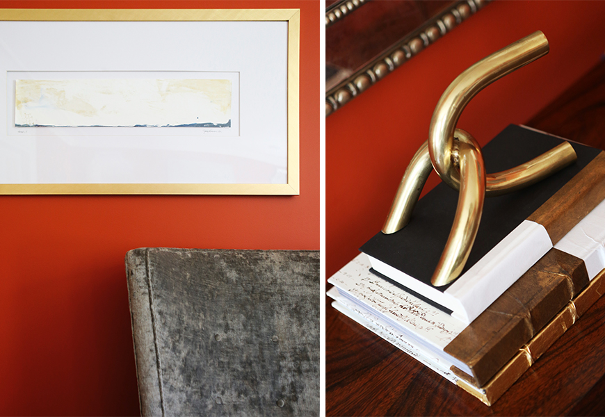
HS: What made this design feel ‘finished’?
SR: As always, it’s the final layer of accessories and art that tie the design together for that finished look.
For this space, Stephanie brought in TCS sofas with Kravet fabric, Schumacher Drapery Fabric and Trim, and original art by Julia Contacessi. To shop these pieces and more visit Kravet (DDB 1201, PDC B624, DCH 150, DCOTA B-180), Schumacher (DDB 832, PDC B523, DCH 4017, DCOTA A-108).
