GDG asked Anne Maxwell Foster and Suysel dePedro Cunningham Tilton Fenwick to finish our sentences and answer some of our biggest curiosities about their second Duralee Collection ‘Tilton Fenwick 2.0’, how they make design decisions, and what to expect in later projects. Read the fun “interview” below.
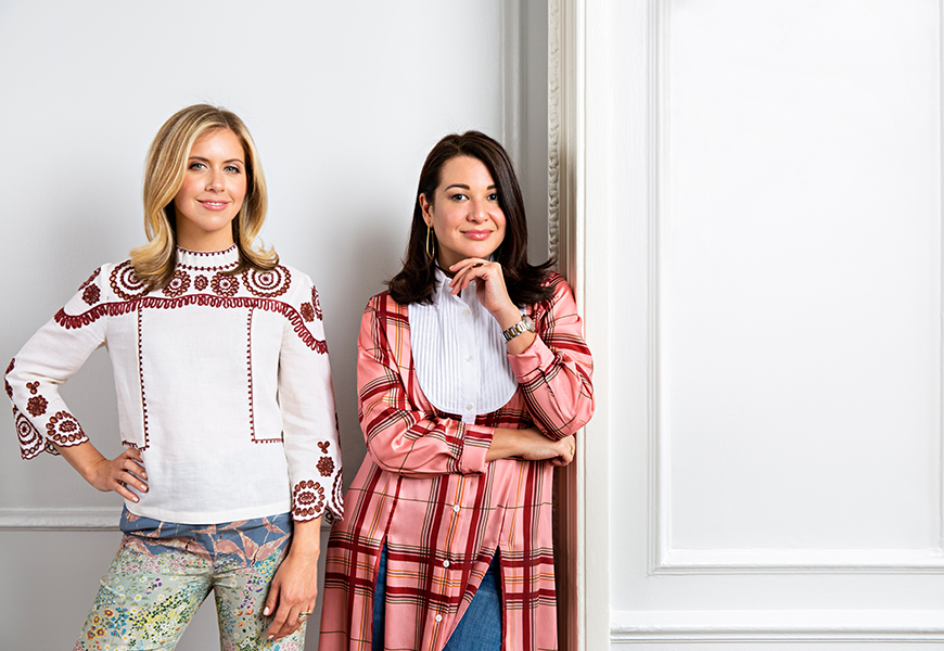
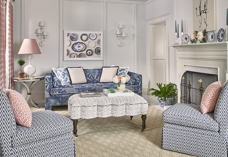
1. Tilton Fenwick 2.0 differs from the original Tilton Fenwick Collection in that…all of the wovens in 2.0 function as wovens and work seamlessly with the prints in that collection.
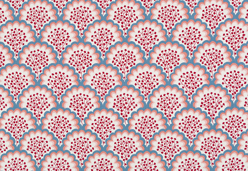
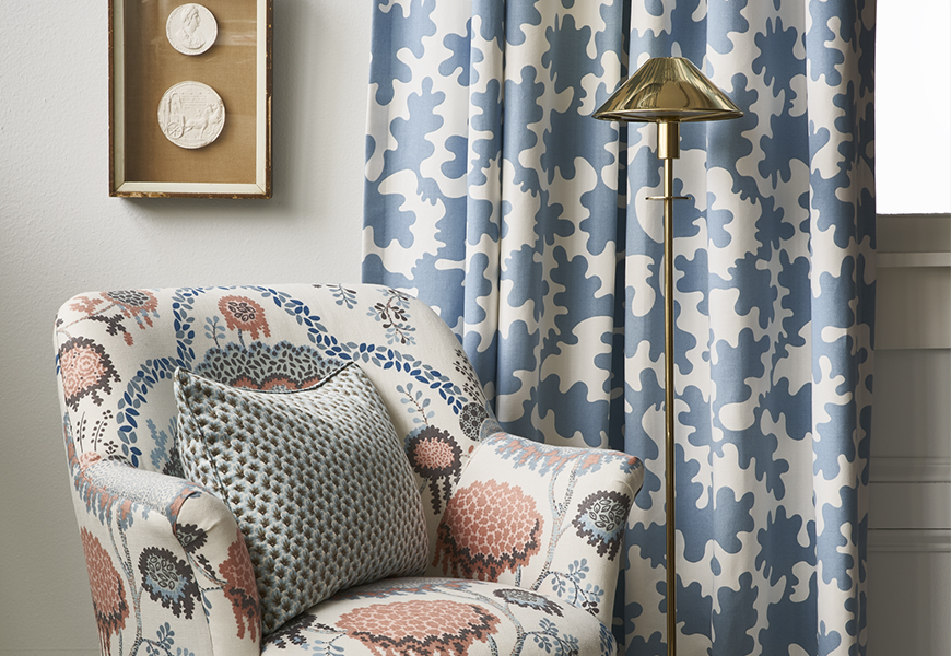
2. If we had to collectively choose one fabric from the collection that embodies the spirit of Tilton Fenwick, it would be…Angelina. It is a scalloped print with whimsy and color, which epitomized the Tilton Fenwick aesthetic.
3. Something we challenged ourselves with or took risk on in this collection was…adding more neutral options.
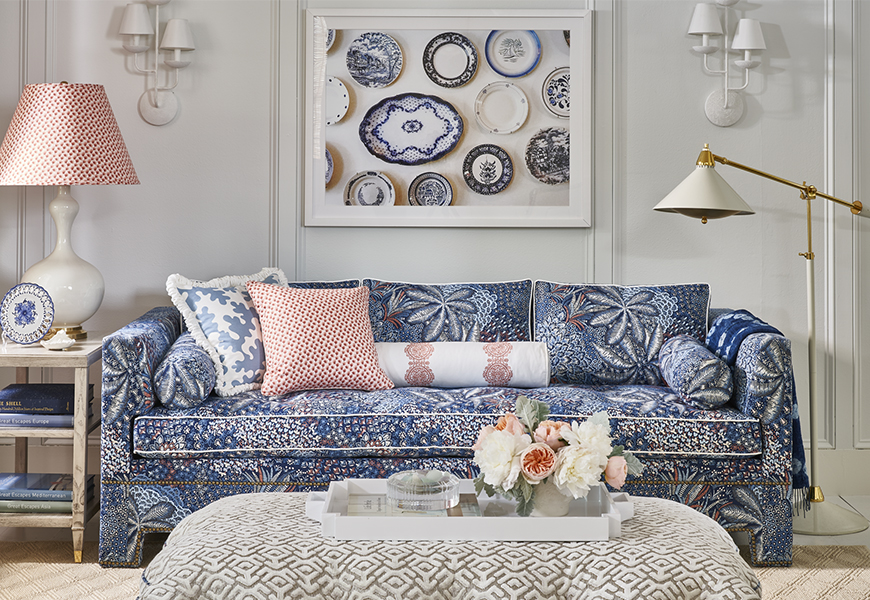
4. A color combination we experimented with was… red and powder blue.
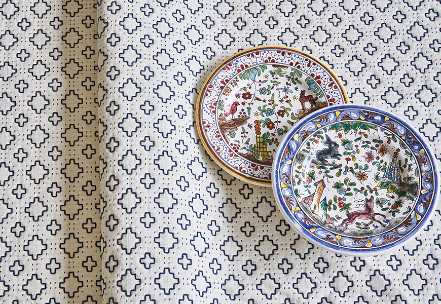
5. A design element we always agree on is…more is more.
6. A favorite project that incorporated the 2.0 fabrics is…our current office redesign.
7. Something we’re looking forward to incorporating more of in future projects is…fabric pasted to the walls now that RAD [Robert Allen Duralee] group offers paper backing to their fabrics!
8. The soul message of our collections is…the layering of pattern on pattern adds exuberance to any room.
See the full Tilton Fenwick 2.0 Collection on the Duralee site here.
