One peek into star Designer Alex Papachristidis New York City dining room will leave you plum — which judging by recent interior trends is the opposite of glum.
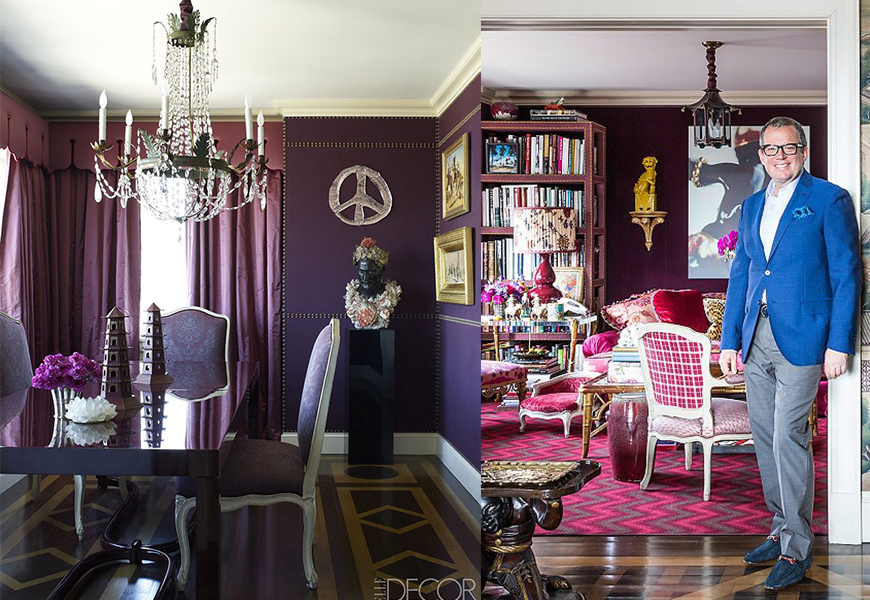
Papachristidis deems plum purple a neutral, rather than an adventurous hue according to a feature in Traditional Home, feature, Setting the Table with Alex Papachristidis. “It looks beautiful with so many colors,” he said, “It makes my blue-and-white dishes pop.”
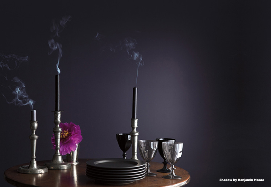
Other industry pros agree. Benjamin Moore’s Color of the Year 2017, ‘Shadow’ is moody and mysterious, an amethyst inspired by the dance of light and shadows at dusk. The violet shade reminds you of that perfect velvety version of nightfall right as the day is dissolving.
Purple’s have been associated with royalty, power and wealth for centuries. Fun Hue Fact: Queen Elizabeth I forbade anyone except close members of the royal family to wear it. “Tyrian Purple,” now a color within Benjamin Moore’s Century Collection, was worth its weigh in gold in ancient Rome, due to the difficulty and wealth it took to achieve that pigment. Luxe designers are still weaving this fabric gold.
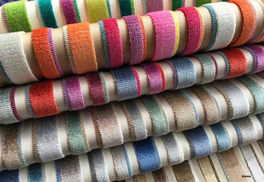
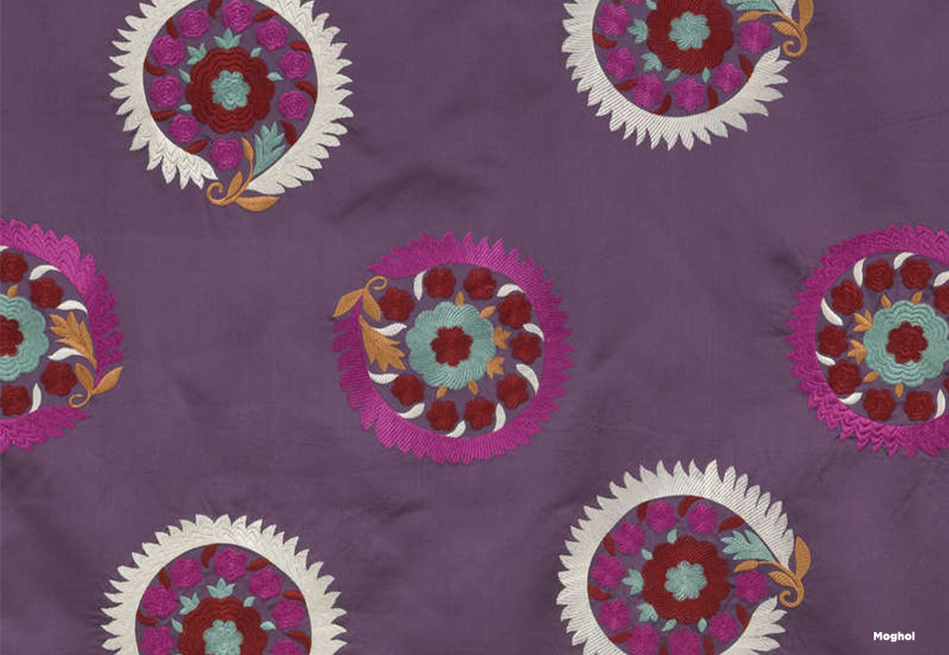
“Hema” in Cardinal by Manuel Canovas, available at Cowtan and Tout provides rich striations of deep purples layered with fiercer reds and shadowy blues and greens. “Moghol” in Viola at Pierre Frey weds traditional 19th century Uzbekistan motifs atop a plum silk satin. Lastly, continuing with global patterns, Clarence House presents “Imperial Dragon,” where traditional Chinese dragons fly across a lush lavender landscape.
The interior industry has definitely caught a passion for purples and is exploring new shades that will surefire seduce.
Paints available at the D&D Building’s Benjamin Moore, Suite 1803. Fabrics available at the D&D Building’s Cowtan & Tout, Suite 1022; Clarence House, Suite 205; Pierre Frey, Suite 1611.