Every year since 1973, celebrated interior designers transform a luxurious NYC townhouse into a curated museum of extravagance. Each hand-selected designer is assigned a space from stairway to steam room to fashion with fine furnishings, finishes, art, and technology over the span of 10 weeks, culminating in a grand opening Gala and month-long public display. For over four decades, this event has raised critical funds for the after school and enrichment programs for the Kips Bay Boys & Girls Club and is always a must-see event for thousands of design enthusiasts.
This year, the unusually large and impressive 15,000 sf, $50+ million townhome sparked the imaginations of the 22 participating designers and continues to dazzle guests. Go Design Go chatted with a few of the top talents including Caleb Anderson, Bunny Williams, Alexa Hampton, Sasha Bikoff and Stefan Steil, giving us a secret window into their room inspirations.
All That Glitters Is Gold
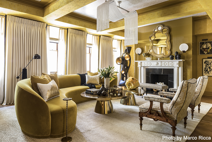
Drake/Anderson’s salon shone brightly with their golden oasis inspired by a two-fold goal of creating balance.
“The first, creating a room that felt grand and formal, but that was also comfortable and intimate; the second, a room that was bold, but also had a sense of restraint. Another inspiration was a subtle theme of movement and reflectivity throughout the space,” Caleb Anderson explained.
This glamorous space also overcame a few design obstacles and behind the scenes shuffling. Fabrics were sent to India where glistening beads were sewn on by the thousands, while the lack of clock outlets challenged the team to employ battery-powered spotlights for the six works of art around the room, that must be charged daily.
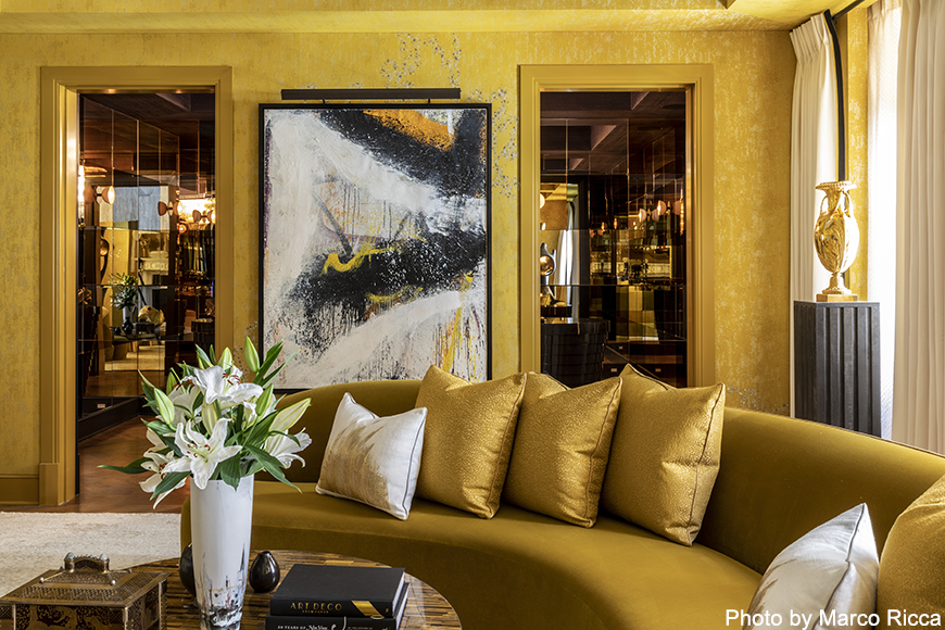
Caleb’s favorite feature in the space includes the Lelievre fabric covering the Aesthetic-era chairs. He said that the combination of this fabric in front of the Nicolas Carone painting, offers “a beautiful design dialogue.” GDG particularly loved the salon’s area rug by Stark and simply swooned over the curvaceous sofa outfitted in gleaming Style/Library velvet. We can totally picture James Bond, martini in hand, posed in front of the statement Chesneys fireplace too!
“We wanted people to feel like they could have an intimate, glamorous evening cocktail hour with their closest friends; to evoke a sense of stylishness and elegance, whether it be this decade or a few in either direction,” Anderson said.
Not including his own room, his first choice for favorite space would be Juan Montoya’s space for its captivating celebration of Wiener Werkstätte.
Bunny’s Tree House
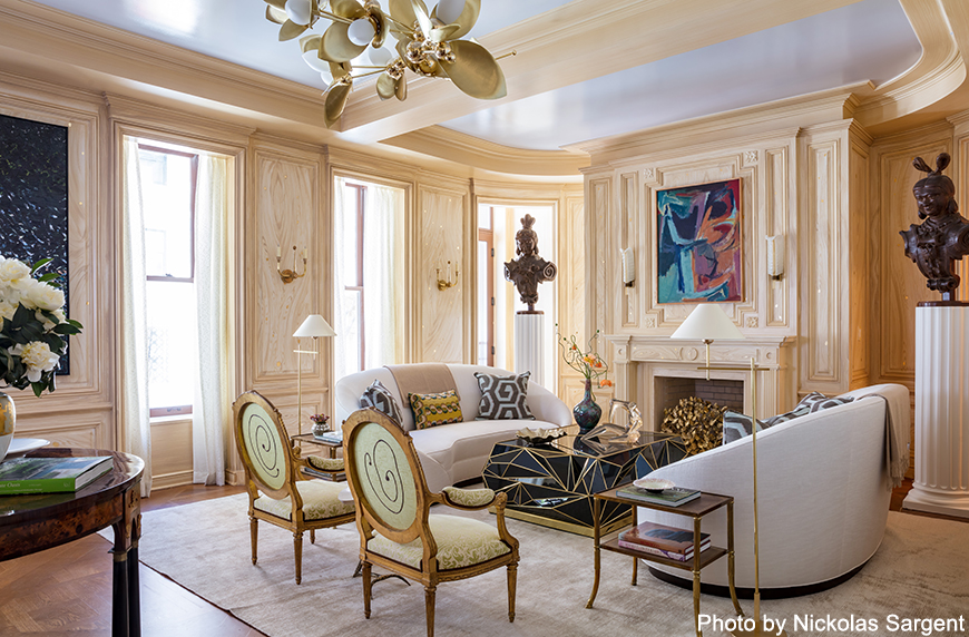
“The first element that inspired the design of the room was Bunny’s idea to have decorative painter, Bob Christian, Faux Bois the walls in a whimsical tree motif, which completely transformed the room,” said Elizabeth Swartz, the recently named Partner and Senior Designer of Bunny Williams Home.
The faux fashioned walls of Bunny Williams’ modern tree house were brightened by a full gloss Farrow & Ball painted ceiling as the room centralized with a sitting area steeped in Pierre Frey, Kravet, Jim Thompson and Fortuny fabrics encircling a sleek, jet-black Newel faceted glass table.
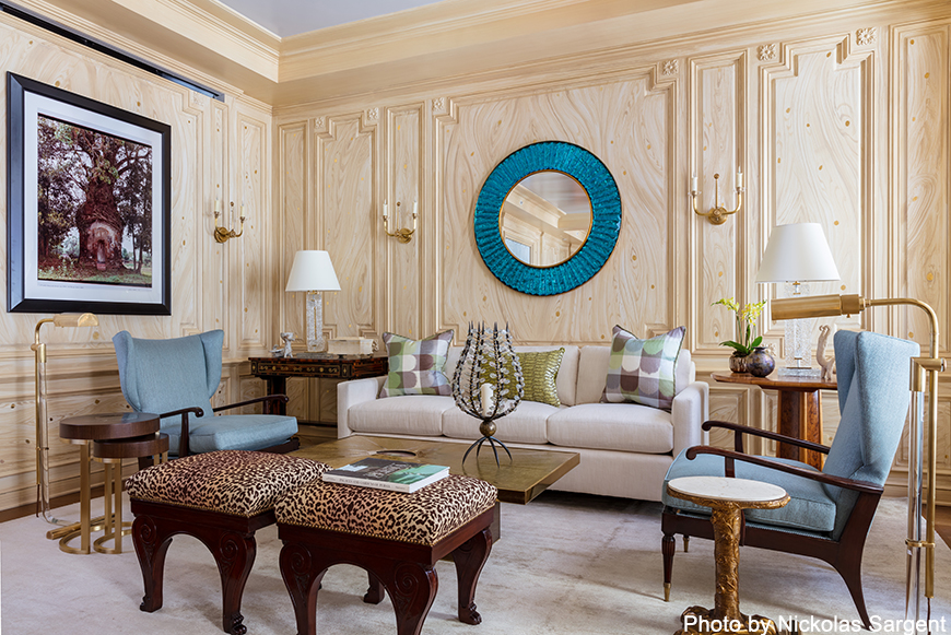
“We wanted the room to be a mixture of the things we love, so we combined fine antiques with mid-century pieces and layered in some modern art with antique textiles, to evoke a sophisticated, carefully nuanced room that people could feel enveloped in,” Swartz said.
As for favorites, Swartz doesn’t pick them, but was grateful for all of the designers and supporters involved in the 2018 Show House.
The Big Top
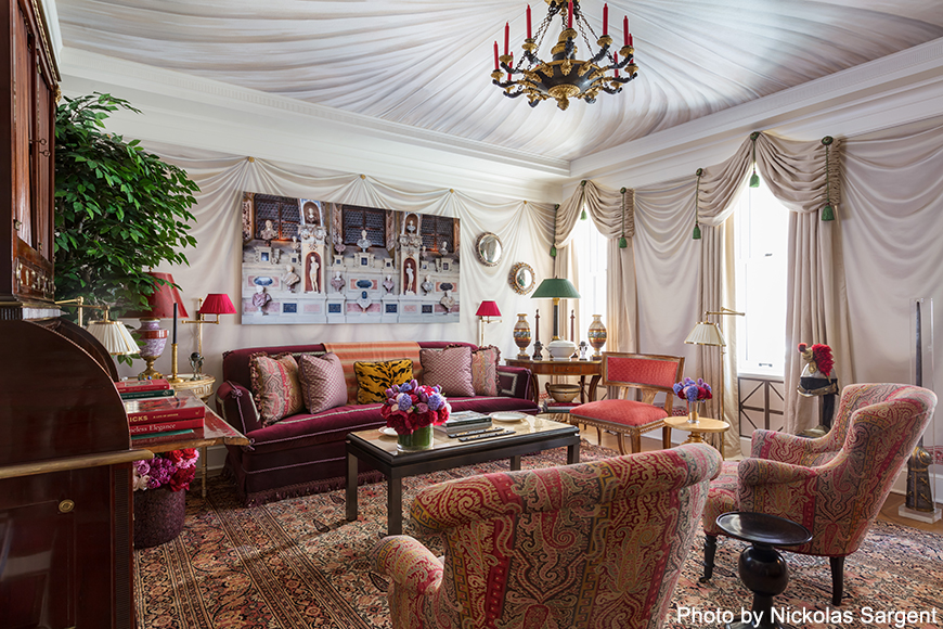
Alexa Hampton’s modern, yet ancient-inspired faux tent interior, named ‘Olympia Folly,’ transported us to Greco-Roman times, but with creatively contemporary movement.
“I was taken by the idea of making a campaign tent that had tokens of empire building embedded in its makeup. I love classicism and the many moments in design history that nod to classicism,” Hampton said.
The biggest challenge for this design came in conjunction with a huge collaboration with de Gournay wallpaper. An entirely new design was hand painted in Europe over the course of about a month and Alexa said ‘the time crunch almost got us!’ But, it didn’t!
Overall, Alexa wanted the room to create a feeling of decadence with lush colors and regal pigments “to offset the coolness of the off-white tenting.”
In addition to the other participating designers, from Alexa’s floormates alone, she says Brian del Toro, Katie Ridder and Mark Sikes ‘BROUGHT’ it.
“Their three bedrooms could not be more different from one another, but I loved them all and wanted to dive under the covers in each one of them,” Alexa said.
A Room ‘With’ A View
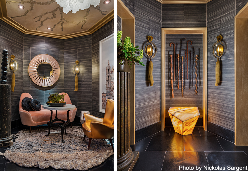
A nod to (and title borrowing from) the 1985 Merchant-Ivory film, “A Room with a View,” Stefan Steil, of Steilish Interiors & Architecture, pays homage to the lush romance of Italy within his windowless space.
“The unending pursuit of beauty and joy, and a pronounced love of nature and form. A transitional space in which to leave the city (and its cares) behind, the small room is meant for tranquility and contemplation,” Steil said. “To encourage a pause between the urban exterior and the private interior of the home.”
Traditionally a “hardworking,” L-shaped pathway out of view, this space becomes more visually inviting and experiential with Steil’s poignant focal points. Soft mohair fabric from Élitis brighten the sofa and side chair and offer a pink pop in front of a dark-tiled wallpaper “Travertine” by Brian Yates and available at Romo.
Tired eyes can rest upon the impactful view from Markus Brunetti’s oversized photograph of Catterdrale di Santa Maria Assunta in Siena, functioning as a “window” to the world.
The Staircase That Broke Instagram
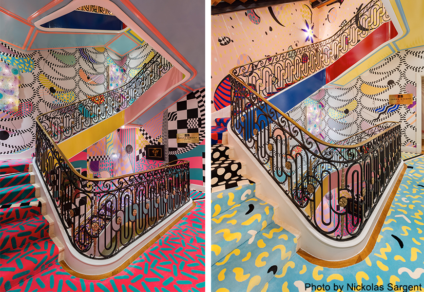
Sasha Bikoff’s staircase needs no introduction! Although not quite a “room,” Sasha made the most of the townhome’s multi-level stairway with a kid-friendly design that had everyone feeling inspired.
The “palette cleanser” between the house’s “courses” offered the brightest Memphis Milano style; channeling old-world euro traditional architecture juxtaposed with 1980s Miami design.
“Before I even started making fabric selections and pulling paint swatches, I knew I wanted my space to speak to the kids and show them that their creativity should always be ignited when it comes to achieving their dreams,” Sasha said.
Sasha’s custom The Rug Company staircase carpet and aptly named, ‘Borderline,’ ‘Swiss Cheese’ and ‘Candy Ribbon’ Voutsa wallpaper created her stairway to design heaven. For more on Bikoff’s show-stopping staircase, check out last week’s The Staircase That Broke Instagram.
Open the doors to more design within the 46th Annual Kips Bay Decorator Show House all month long. The display runs through May 31st and is located on 110 East 76th Street New York, NY. Mondays – Saturdays 11 a.m. – 5 p.m.; Tuesdays and Thursdays 11 a.m. – 8 p.m.; Sunday Noon – 5 p.m. Tickets can be purchased here. Be sure to share your favorites with us on Instagram!
