Esteemed British Interior designer Kit Kemp spills about her widely celebrated projects in hospitality, you know, the Firmdale Hotels (including The Crosby Hotel and The Whitby Hotel, dream-stays of every New Yorker), retail, as we saw in her Bergdorf Goodman installation this spring, and textiles, particularly her latest collaboration with Andrew Martin, available through Kravet. Read between the whimsies below.
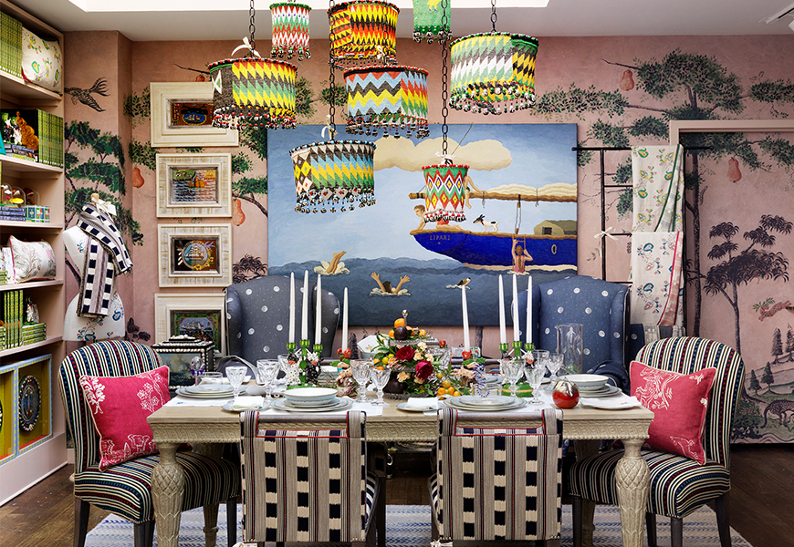
(Above) Kit Kemp’s Bergdorf Goodman spring 2019 installation
Go Design Go: Your Bergdorf Goodman project is whimsical and fantastical, and you mention it encompasses everything you love in one space. Was it difficult or easy to edit down your existing collections and new finds in this kind of project?
Kit Kemp: It is the first time I have had the opportunity to see all the collections that I have designed for different brands in one place working seamlessly together. The good-sized loft space at Bergdorfs was spacious enough for me to design a bedroom, drawing room and dining room. The secret was to change the colours from area to area without it looking obvious. There are pastel colours used for the bedroom, much stronger greens and reds in the drawing-room area, and indigo blues in the dining area. I used my 3 meter vertical repeat wallpaper called Mythical Land to unite the spaces. We originally designed the wallpaper especially for the Anrep Room, a private event space at The Whitby Hotel and noticed how versatile it could be. It was the starting point of my fabric and wallpaper collection for Andrew Martin which is now distributed through Kravet in the U.S.
(Above) Kit Kemp’s Bergdorf Goodman spring 2019 installation
GDG: Were there any limitations you can share with us about the space and how you could design it?
KK: We changed the alcoves and spaces within the loft to suit our furniture. We added a fireplace to create a focal point for the drawing-room. There are no windows but the overhead light is very bright and unforgiving if you get the balance wrong. We have a great team, plus Bergdorfs is very encouraging and fun to work with. We plan and think ahead to try to eliminate surprises. Limitations within a space can be the inspiration for better creativity and creating fun. The devil is in the detail. It is the details that often capture the imagination and make a space memorable and curious to the viewer.
(Above) Kit Kemp’s Bergdorf Goodman spring 2019 installation and Kit Kemp (Right)
GDG: You’ve done so much residential and hospitality. What were you looking forward to experiencing with designing in a luxury retail space?
KK: Yes we were very happy to be asked to design a retail space. I was surprised by how many collections we had created recently. Two Wedgwood dinner services, a carpet collection for Wilton Carpets, a furniture collection for Anthropologie, fabric, wallpaper and carpet collections for Christopher Farr and Andrew Martin. An embroidery collection for Chelsea Textiles plus our own perfume, stationery and patchwork creatures made with all our leftover fabric remnants. Oh yes, and the candlesticks of mythical creatures made especially for the space.
(Above) The Whitby Hotel, New York City feat. Kemp’s textiles
GDG: At your Whitby Hotel celebration for your new fabric and wallpaper collection, we noticed a candy theme throughout the whole lower level where your new textiles and wallpapers were displayed. We especially loved the cheeky “Kit Kat” coffee table. Can you tell me about why you enveloped this theme?
KK: When designing we are always thinking of the most environmentally friendly way to make beautiful designs. Sometimes this results in innovative products such as our laundry bag which is made from 6 – 8 recycled plastic bottles and features my Ozone fabric. Our bottles are made from a derivative of bamboo and sugar cane. Why not sometimes turn it on its head and make junk food the object of the furniture like the cheeky Kit Kat coffee table. The lights look like lollipops and the stools look like licorice allsorts. My favourite story as a child was Fudge in Toffee town, a whole planet that was made of sweets. I often think marble pillars look like a strawberry ripple, and coloured glass-like candy.
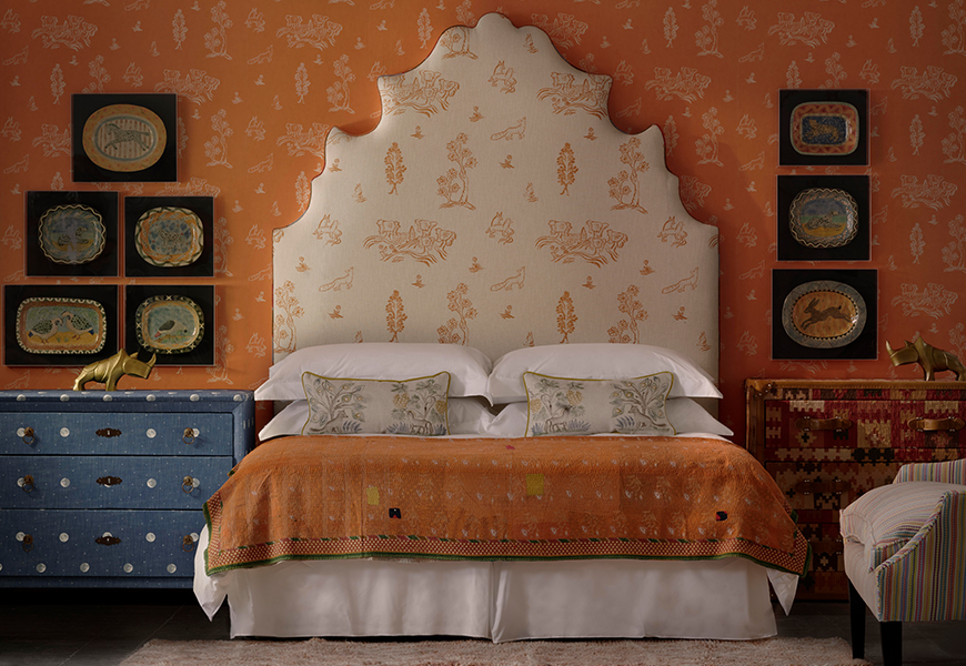
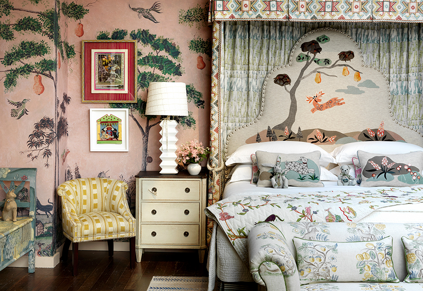
(Above) Kit Kemp and Andrew Martin’s new collection, shown here on headboard and wallcovering in “Lucifer” print.
GDG: Can you tell me more about your new textiles and wallcoverings that you created with Andrew Martin? What direction did you take aesthetically and how do you wish your clients to adopt them functionally?
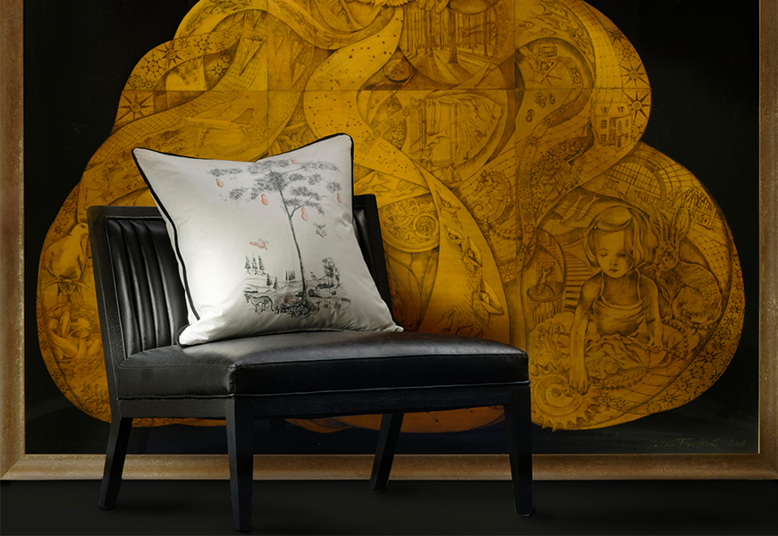
KK: We love colour. It makes you happy. The creative process began when I stumbled upon tapestries from the 15th century. It was fascinating to see these magical creatures hiding behind leaves and under hedgerows. That was the start of the idea, to give them new life in a contemporary world. As well as tapestries, Native American art provided inspiration for the Apache print while Mythical Land takes its cue from American Folk Art. We started with Mythical land, and then went on to design Friendly Folk which is a new and simpler take on a Toile de Jouy design in lovely base colourways. Psycho Sprig takes a provencal sprig idea but it is reinvented in zingy contemporary colours. Basecloths are important so we had fun with linen, cotton twill, and chintz. Chintz has been so out of favour it is about time to return to this gorgeous fabric finish with brand new designs. When photographing one of the monochrome chintzes we put my ‘Pear Tree’ chintz cushion on a sleek black leather chair with a huge artwork by Mila Furstova in the background. It is such a witty, winning combination.
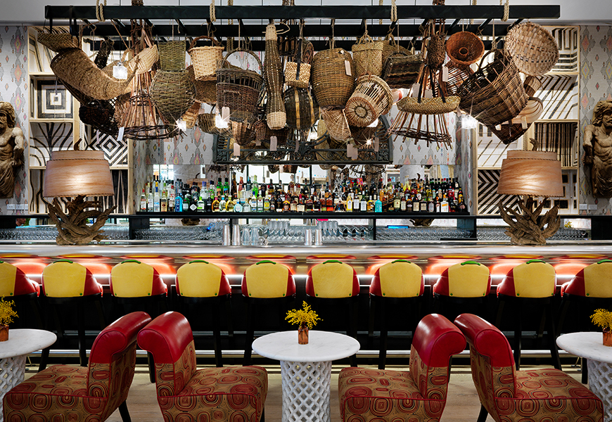
(Above) Whitby Hotel bar, New York City
GDG: The Whitby and Crosby, can you tell me about how their designs compare and contrast?
KK: Every building tells its own story. Both these buildings are new builds but the last thing you want is for them to look like a new build as you enter. They should have an enveloping atmosphere that fills you with curiosity and a feeling that you want to venture around the corner to see what’s going on. It should be an adventure.
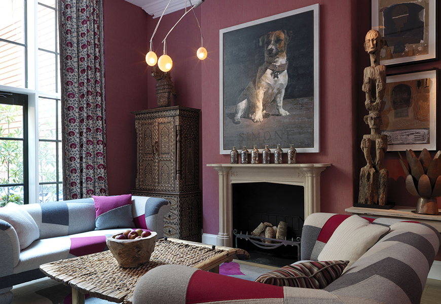
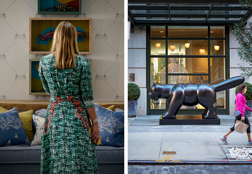
(Above) Crosby Street Hotel, New York City
Crosby Street Hotel received the first Gold LEED Award in New York City for the environmental way that we built it. We have chickens that like sunbathing in summer plus a vegetable garden on the roof. The artwork is interesting with the mega-sized Botero cat outside because the hotel is set back from the street. We did not have this luxury midtown at The Whitby Hotel but sculpture and artworks abound. We are very democratic in the way that we hang art. Well-known pieces sit cheek by jowl next door to students soulful artwork and skillfully crafted pieces like baskets and ceramics. We host Art Walks at Crosby Street Hotel with Lyora Pissaro who is our Art Ambassador. I think it is interesting to see how art is hung in a living setting rather than an austere art gallery. We then go to local art galleries and afterward back to our hotel restaurant to discuss everything we have seen during the day. I love this salon-style way of sharing ideas and meeting likeminded people. The Bloomsbury Group including Virginia Woolf, Vanessa Bell, and Duncan Grant shared buns and tea with their friends and generally had a great time discussing methods and styles of art. They can be our inspiration.
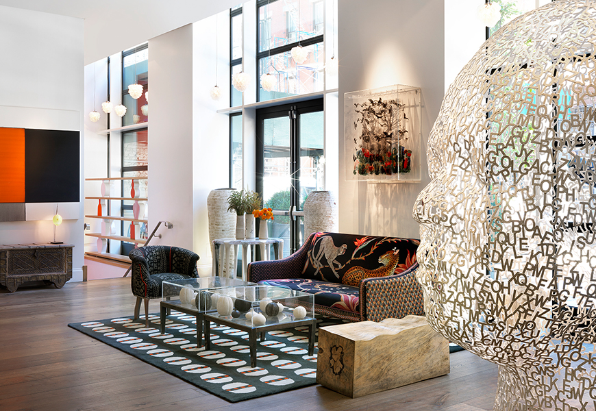
(Above) Crosby Street Hotel lobby, New York City
GDG: Besides your design being art itself, do you design with art in mind (art that will be added and layered to a room upon completion and over time)? Does art guide your design process?
KK: I think art guides the design process and will always be my inspiration. I realize that there has to be an intelligent thread that goes through the design process from top to bottom. It makes a building congruent and harmonious. Too many interior designers working on the same project can be a mistake because you can so easily lose harmony. Equally too many ideas are confusing and too few ideas make a glutinous glob that is unmemorable.
There is no foolproof recipe. I don’t like frantic interiors, I don’t like timid interiors but I do like bold interiors that have a point of view and something to say.
(Above) “Travellers Tales” cushion from the Kit Kemp x Andrew Martin collaboration
GDG: Something you seem to nail in your exquisite furniture is proportion. Can you tell me how you approach and execute proportionate, comfortable pieces?
KK: Proportion is everything. It is fun to play with proportion but at the end of the day, it has to balance to work well. I was lucky enough to start my career working for an architect called Leszek Nowicki. He came to England via Siberia and then studied architecture. My first job was to make tea and stand with a tape measure in my hand as he measured rooms and buildings, furniture and ancient properties all over the country. I saw scale and proportion on a daily basis. I didn’t realize at the time that I was learning but it is all part of the process and joy of being involved. I looked at art and craft and how to utilize it economically and boldly within a space. We are so lucky to be in a business where we never stop looking and learning.
Click here to see Kit Kemp’s new Kravet Collection with Andrew Martin. Available through Kravet in suite 1202 at the DDB, Suite 150 at the DCH, Suite B690 at the PDC and Suite B-180 at the DCOTA.